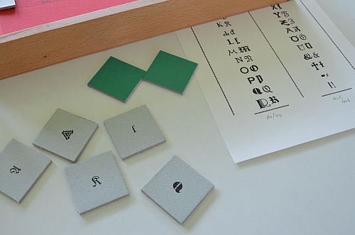
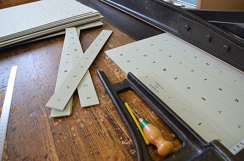
I am being somewhat eccentric. Not only do I really love the art of letterpress printing, but also find greatest joy using metal type. To many people this may seem to be senselessly time consuming. People keep asking me why I persevere, even as far back as when I started in 1999. I still haven’t yet found an appropriate answer.
I like my metal type and also the pieces made of wood. Most of them are real little beauties. Some are a bit strange and some print easily, whilst others are a real pain to work with. Sometimes it seems to me as if they were just like ‘people’: some you get along with from the start, whilst with others you keep on getting it wrong.
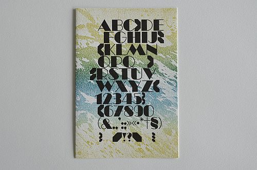
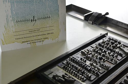
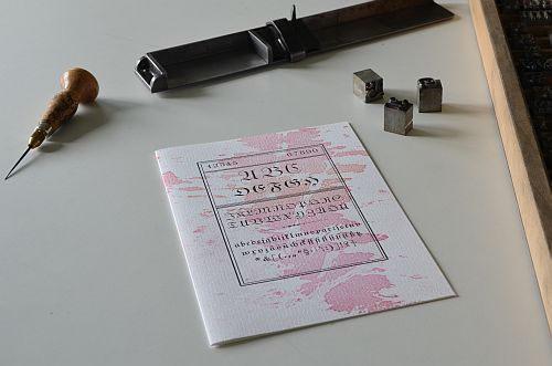
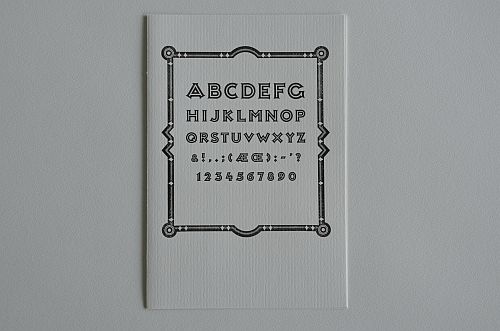
My many samples of metal type are like my ‘team of staff’, with whom I work every time I’m involved in the printing process. So I decided to give my type the possibility to stand up for themselves. For all of 2012 I’ve been printing my alphabet cards. Now, in early December, I’m nearly finished printing the entire set. Each alphabet shows itself off on a single artist’s card printed on my hand-driven proofing press. Some cards wanted ornaments to surround them, others wanted a background print and some demanded to just exist on their own, if you please.
So here they are. Almost one hundred of them. Of course the cards are limited editions – neither signed, nor numbered – however, there are not more than 30 copies of each card.
I decided to work on strong paper with a good structured surface, mainly white, some off-white or even a pale grey. The background prints are linocuts or typographical designs using a larger size metal or wood type.
The cards are all half folds and on the back of each card is the name of the font, the year when it was issued along with the name of the type designer including the years of his/her birth and death.
To find all cards on display please go to:
http://www.paper-fold.papiergebunden.de/html/alphabets.htm


