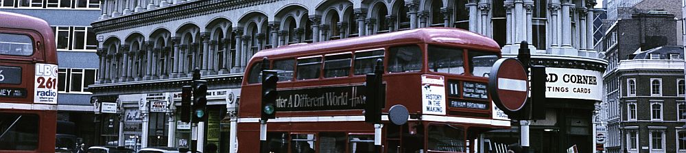
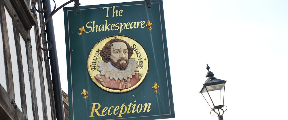
In Stratford upon Avon

The Bodleian Library, Oxford (UK)
William Shakespeare died on April 23rd in 1616. By then, besides his plays, he had written 154 sonnets. In 2016, 400 years after his death, the Centre for the Study of the Book at the Bodleian Library in Oxford called artists worldwide to print all of Shakespeare’s sonnets afresh.

I consider myself lucky that I was given the opportunity to be part of this effort. I was assigned sonnet 89 which reads:
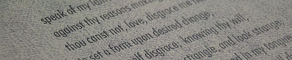
Say that thou didst forsake me for some fault,
And I will comment upon that offence:
Speak of my lameness, and I straight will halt,
Against thy reasons making no defence.
Thou canst not, love, disgrace me half so ill,
To set a form upon desired change,
As I’ll myself disgrace; knowing thy will,
I will acquaintance strangle, and look strange;
Be absent from thy walks; and in my tongue
Thy sweet beloved name no more shall dwell,
Lest I, too much profane, should do it wrong,
And haply of our old acquaintance tell.
For thee, against myself I’ll vow depate,
For I must ne’er love whom thou dost hate.
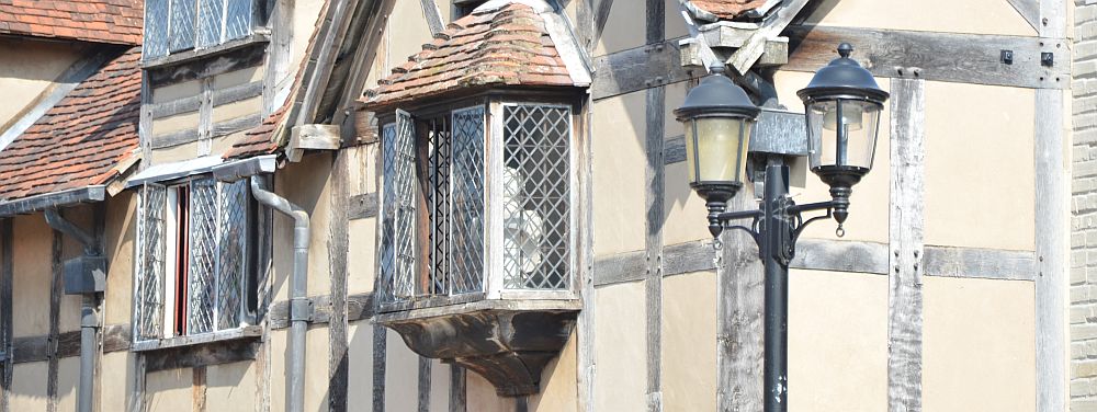
Stratford upon Avon, Shakespeare’s birthplace
There have been many attempts to transfer Shakespeare’s works into German. The list of writers and poets who did so, is a collection of many big names: Wieland, Schlegel, Tieck, Friedrich von Schiller, Theodor Fontane, Erich Fried, Peter Handke. There have been others as well. In the early years of the 19th century a group of writers and poets teamed up to accomplish the task: Schlegel, Tieck and von Baudissin. Translating the sonnets proved to be particularly tricky. In 1826 Ludwig Tieck presented a translation of the sonnets. He admitted due to lack of time and his poor health „a younger friend“ had helped. It took some time until it was revealed that the sonnets in fact had been translated by Tieck’s eldest daughter Dorothea. Years later, in 1831, she would write to Friedrich von Üchtritz saying „I believe, translating is a much more suitable work for women than for men, particularly because we are not allowed to produce a work of our own.“
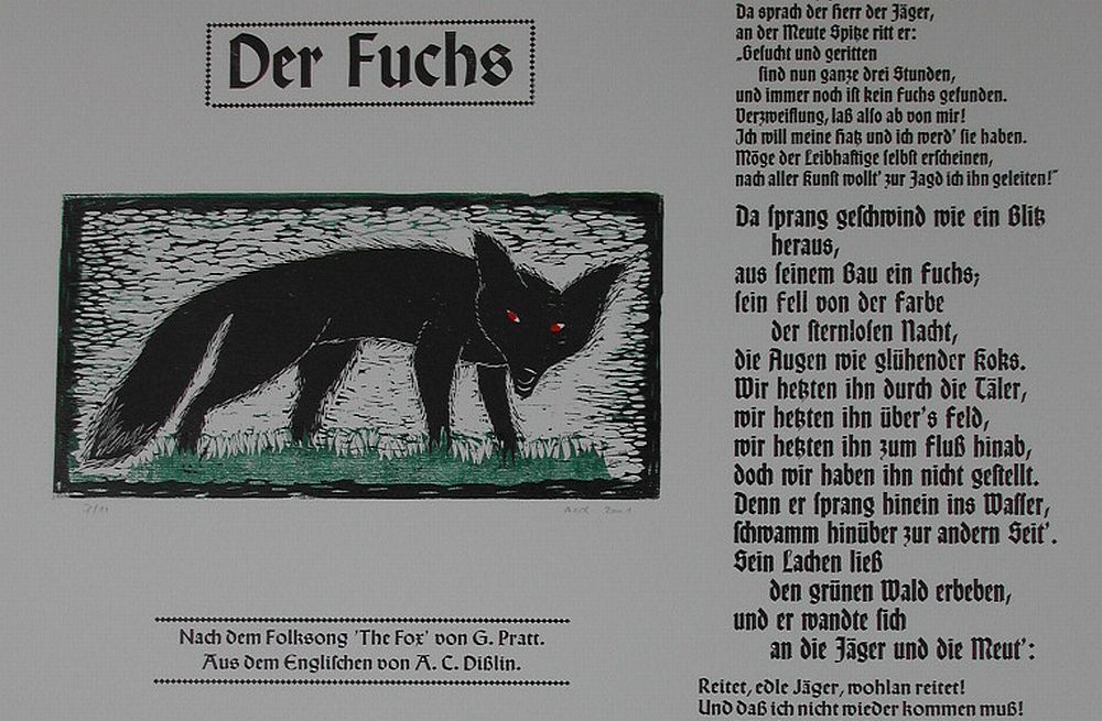
Many years ago I came across a book published in Berlin in 1909. The title is „Shakespeare Sonnette: Umdichtungen von Stefan George“. A great poet himself Stefan George did not claim to have translated the sonnets, he tried to write them all over again in German. He kind of converted them. This is how sonnet 89 reads in his words:
Sag, du verliessest mich um einen fehl,
Und ich entschuldige dich für diesen schlag.
Sag, ich sei lahm, so hink ich auf befehl
Da ich mit deinem grund nicht rechten mag.
Du, Lieb, verstössest mich nicht halb so schlimm
Um dem erwünschten wechsel form zu leihn
Als ich mich selbst verstosse .. du bestimm!
So töt ich freundschaft; schau als fremder drein ..
Bin fern von deinen wegen .. nie mehr sei
Dein süss geliebter nam auf meinem mund
Dass ich Unheilliger ihn nicht entweih ..
Und etwa künde unsren alten bund.
Dich schützend stoss ich nach der eignen brust;
Ich darf nicht lieben den du hassen musst.
Being a lover of the English language I decided to print the sonnet in English.
I set out on 29 February driving south for this very special working visit at my studio. Some six hours later I unlocked the door. In the afternoon light streaming in from the windows I could see finest cobwebs dangling from the ceiling. I had not been here since Christmas. I was looking forward to set free the scent of printer’s ink into the air in a couple of days time. This time my stay would be a three week working visit.

Deckle edge paper ready for printing
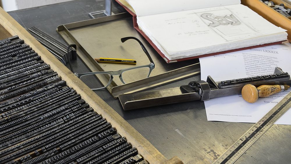
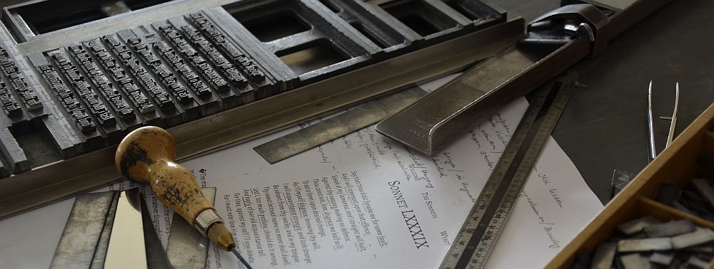
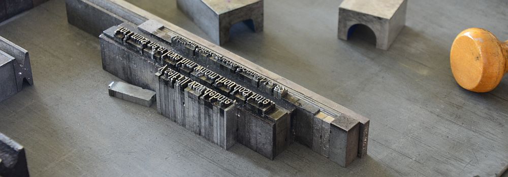
Shakespeare’s sonnet 89 in the press
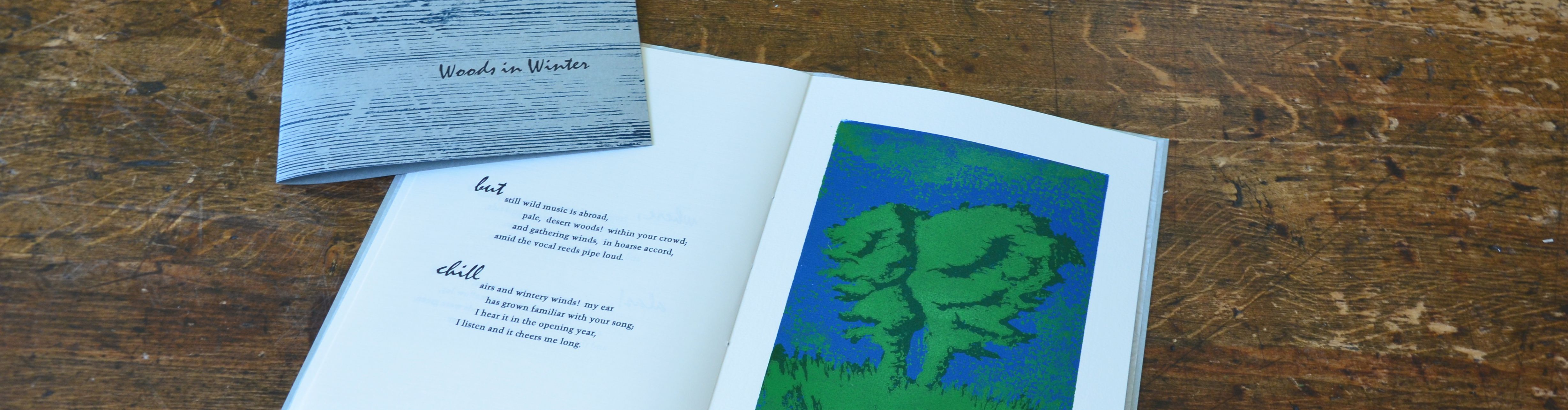
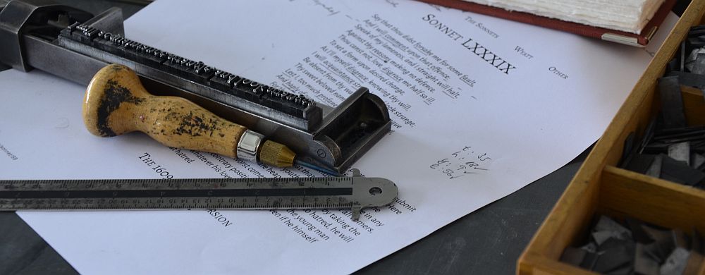
Choosing type can be difficult. I felt the sonnet was like if the writer imagined an argument against him almost in the style of a lawsuit, a trial or court case. To me it sounded like a parol, or the defendant’s last word, confessing it all, pleading guilty on all counts brought forward against him. A court case is something very matter-of-fact, sober. As far away from romatic as could ever be. No story, a report of a status, a plea of guilt. Nothing to it. Pure information, the sheer character. This broke it down to just one fount: Futura. I went to get the case with Futura, 20 pt condensed light. After some consideration I decided to use only lower case characters. In the sonnet it is the speaker’s intension to make himself small as can be, his own will or needs almost non-existent. Or rather: reduced to serving the beloved’s will whole scale. No justification for a capital I whatsoever. The only capital letter being the first letter of the sonnet printed from lino. The sonnet’s text is printed blue, resembling truth in a double sense: speaking the truth and being true beyond all. The linoblock is printed in purple, with the red hinting on the love that still is a bond between them. Printed on BFK Rives deckle edge paper 250gms, made entirely from cotton. Here it is: an avowal.
A first proof.

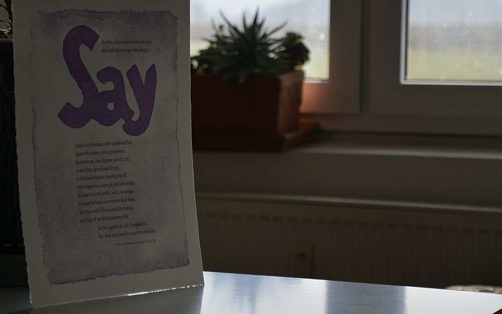
Shakespeare’s Sonnet 89
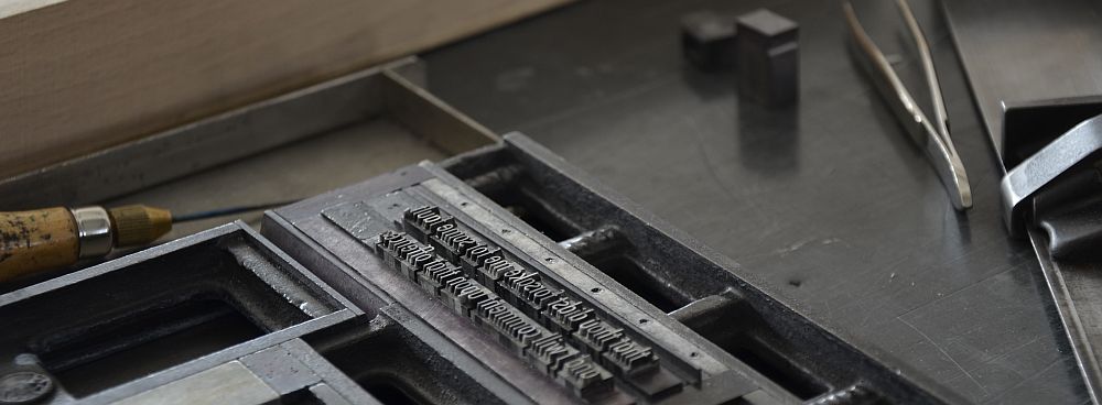
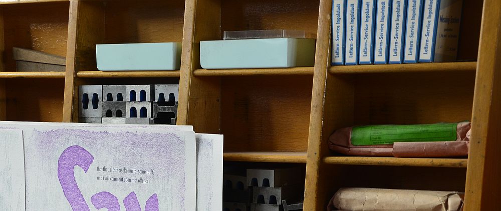
Work finished. I was pleased. I started to tidy up, sort back the type. Sorting back type is something very letterpress, so to speak.
Sorting back type
A job nobody would think of in times of digital work. A rather unloved job because it seems so unproductive. A task that seems utterly tedious, but needs to be done with utmost care. Otherwise the next time you set out to use this case of metal type, you’ll pay the price with the specimens being in the wrong places. Still, sorting back type can have side effects. It had with me as my mind remained under the spell of the sonnet. I could see another layout, with another typeface, another print altogether. I was mesmerised. I went to get the case containing 16 pt Baskerville. I went for the floral border. I tore the deckle edge paper to size. And there it is: the classic in black and green. The green representing hope. Printed on Zerkall mould made printing paper, white, smooth, 225gms.
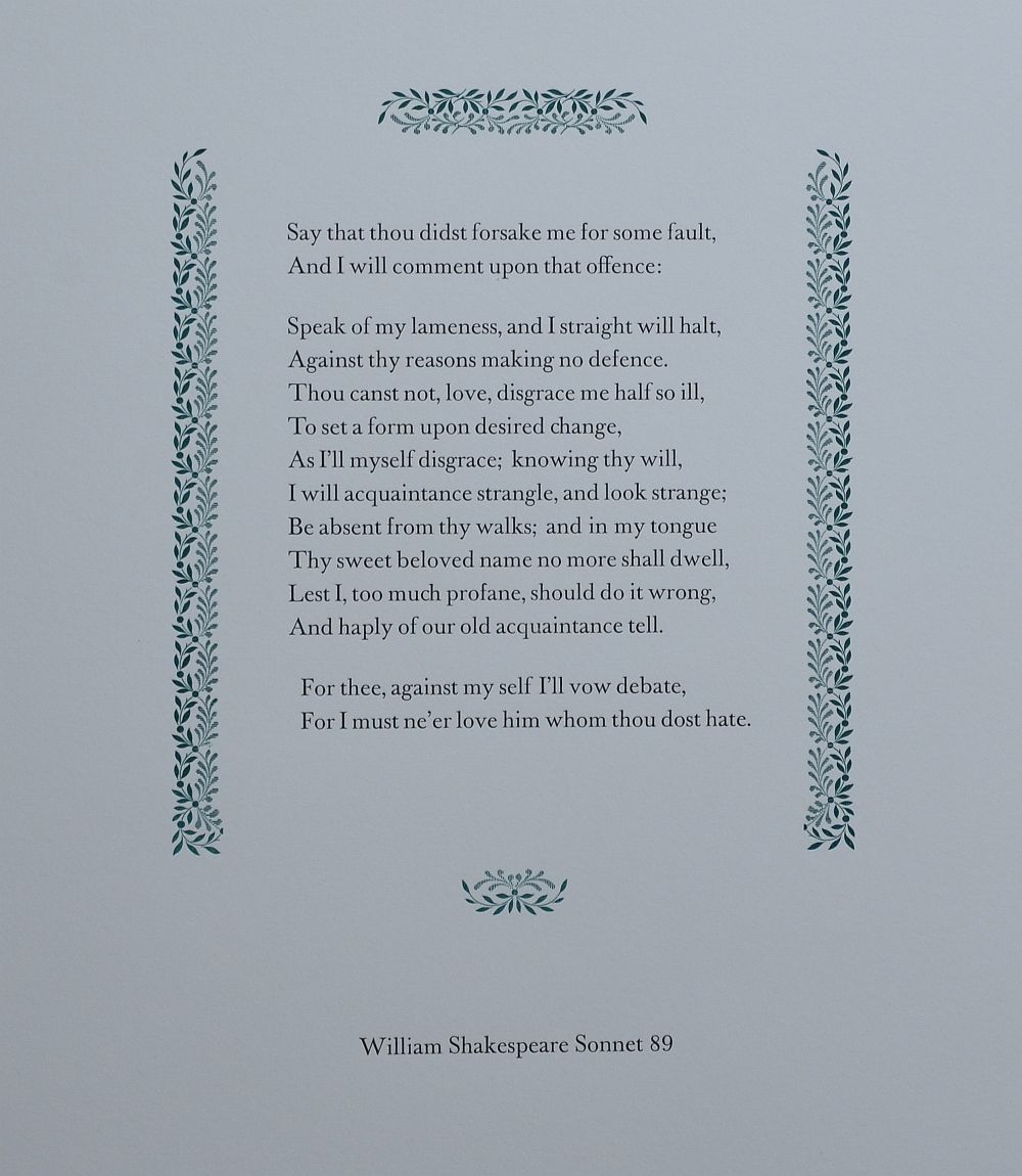
Shakespeare’s Sonnet 89: the classic
I like them both. As I write this, I sit in the kitchen of the old farmhouse where we moved in only a few weeks ago. We have had considerable amounts of rain during the past couple of weeks. While we were staying at Turn The Page Artist’s Book Fair in Norwich severe thunderstorms were lashing through this part of Westphalia. Luckily, the farm was unscathed. Today saw some showers but also brilliant sunny spells that made the pigeons shine like if they were made of pure silver while they were diving into the old oak trees. Their foliage now having taken the heavy shade of green they wear for summer.

In Stratford upon Avon
This effort of the Centre for the Study of the Book at the Bodleian Library is ongoing until September this year. More information on this project is to be found on Twitter: #154sonnets, @theBroadPress, @bodleincsb