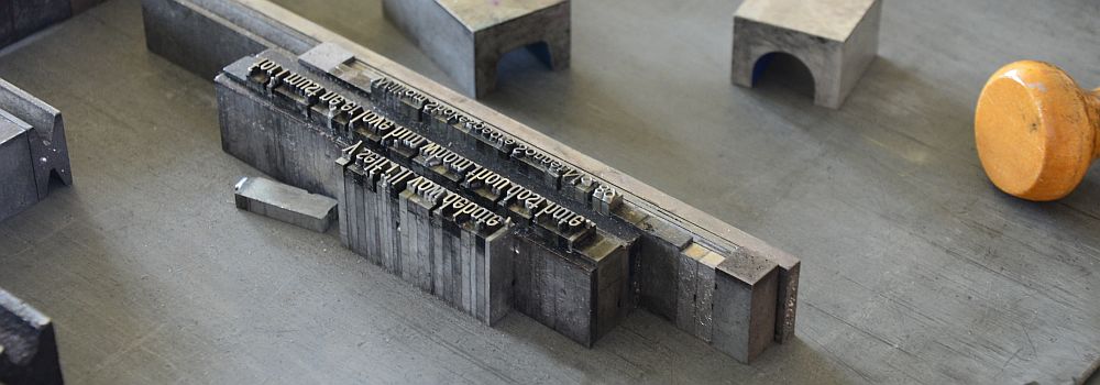
Movable Type.


Movable type

Movable type

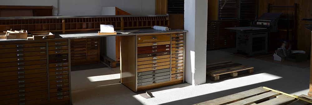
Moving tons of metal type and printing presses is a hard job to do, no matter what time of the year. However, there was one thing I absolutely did not fancy: having to move my type and presses during the winter months. When in August I realised that all the type cabinets might fit into our barn for short time storage, I considered moving the lot during October. The printroom is still far from being finished, but it might be ready to use some time in December. Having all the printing gear at hand, would mean it can go in there the moment the paint on the walls has dried. Dates were fixed and time went quickly. Add to this: it went cold.

Memphis

Memphis


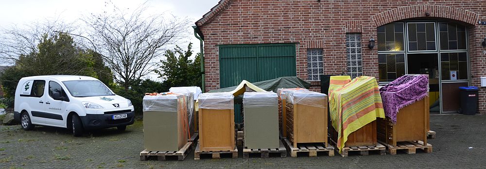
First cabinets on pallets

First cabinets on pallets

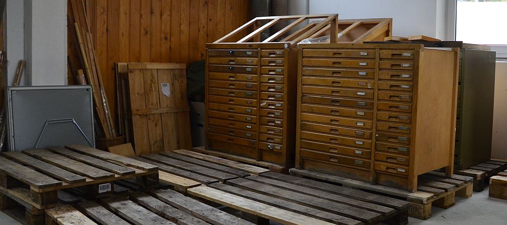
I drove south again on 10 October. I had just about one week to shove all the type cabinets on to palettes and thus get them ready for transport. The articulated lorry would come to pick it all up on 18 October. Packing up stuff is a peculiar job. Each piece you pick up, shove around, wrap in bubble foil and strap to a palette comes with its very own story, be it long or short. Some of those stories you had forgotten about, others you all of a sudden realise you had not even been aware of.

movable-type-hands

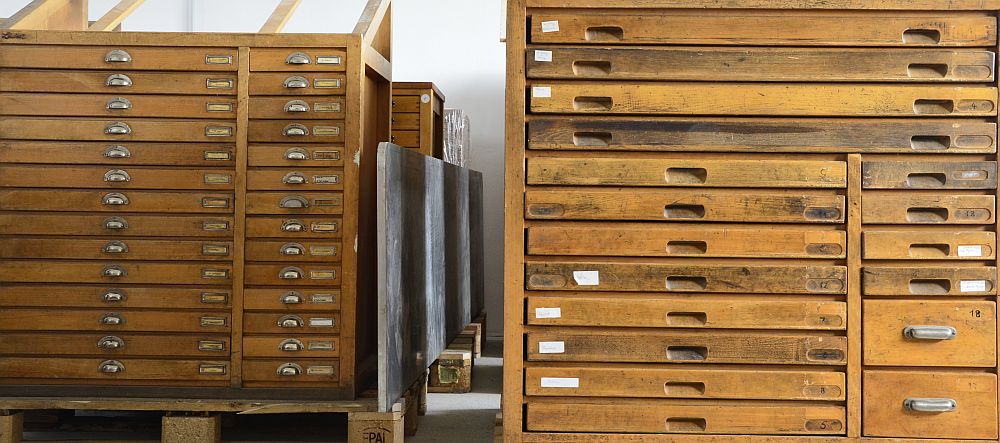
I have a small number of oversized type cases. In German they are called „Brotschriftkasten“, which literally means case of bread type. The reason for this was: the larger cases held more type specimens and were used to compose long texts. It was these cases that helped the printing office make its core income, hence the name bread type: the type that payed for the bread. I kept one of these cases, housing a rather old and worn type, sitting on top of one of my older type cabinets. Normally the cabinets would have been made of beech wood. This one was made of fir or spruce and it looks rather bashed-up. My landlord helped me lifting the case off of the cabinet and place it on another to be strapped in for transport. Only when I started taking the cases out of the old cabinet I became aware of a label that was pasted on to the wood. It was an old rail transportation label stating that this piece of furniture had been on its way from the main station in Stuttgart to its destination on 12 April 1928.

movable-type-cabinets-03

This cabinet was travelling in the times of the Weimar Republic, when Kurt Tucholsky was still alive and writing, a decade before the start of WW2. It reminded me of meeting a printer once at a fair. He was running his own printing office which had been a family business for at least three generations, perhaps more. Both, his father and grandfather had seen all their type taken away more than once by the military during war times – to be made into ammunition. I could almost feel his disgust about such an utterly savage act. Type was the medium that had made possible and helped spread education, knowledge and understanding. With printed books and leaflets people could learn each others languages, could descry other peoples‘ culture and art and customs and recipes. Metal type was a means of understanding, a means of crossing borders and connecting people. „This is a printing office, crossroads of civilization, refugee of all the arts against the ravages of time …“ You can almost hear Beatrice Warde’s words (dating back to 1932) ringing in your ears. You can hardly imagine anything worse than turning metal type into ammunition to kill off people. Nevertheless, it has been done again and again.

Where The Red Poppies Dance

Where The Red Poppies Dance

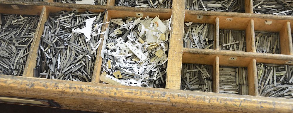
Another of my very old cabinets is the one housing the small family of Trajanus, the fount I used for my artist’s book „Where the Red Poppies Dance“. It is the type of cabinet that comes with four oversized cases plus ten normal size cases and ten narrow cases for larger type. On the Sunday my dear friend Ivonne came to help me all day. A more than heartfelt thankyou goes to her. It is totally her credits that I managed to have all cabinets ready for transport by the following Monday evening. I would not have been able to achieve this without her tireless effort. We took out the large cases and discovered a nest neatly made by one of my furry visitors. What a thoughtful choice! Trajanus is one of my favourite founts and here we were: The specimens of the 9 point lower case ‚d‘ had been snuggled into a neat and cosy looking circle and cushioned with little snippets of paper – part of which had been labels in another of the cases, containing ornaments. But there was still more to come.

Somebody made themselves at home in Trajanus type

Somebody made themselves at home in Trajanus type

When we started to take out the cases in one of the other cabinets, the meanwhile homeless mouse was sitting there staring at us. It had started building itself a new nest on the floor beneath the lowest case. It was a very beautiful mouse, though, with a nice long tail and lovely spherical black eyes. We tried to catch it but with no avail. It took flight and appeard to have vanished. In this place I’ve seen a number of furry visitors and feathery ones, too. Normally I was able to return them into the wild where they belong and are happy. I have no idea what happened to this one. It might have taken its chance to travel to a new place. If so, I’m sure it will love our barn and not regret its decision to cling on. That is, at least until its first encounter with one of the martens that live here, or for that matter our neighbour’s cat.

movable-type-wine-luck

I should have known, but it still came as a surprise that there were so many cases so heavy weight. A few of them were the ones coming with Baskerville. In my first couple of years we were given the opportunity to use a colleagues Monotype caster to cast our own type. We chose to cast 10 point Baskerville. And we decided to cast more than normal, to make it our bread type, so to speak. But there were other cases full to the brim, too.

movable-type-cabinets-04

During this one week I was taking out each type case from each cabinet and putting it back in after the cabinet sat firmly on its palette. I saw them all once again. The ones that I have used often and the ones I always wanted to use and up to now never found a suitable project for. I saw all the ornaments, decoration, borders and clichés. I cut up my old worn needle felt carpet from the floor to use it as padding in the cases.

Old carpet as padding

Old carpet as padding

On one day I came across two cases that were amongst the first I had bought. The owner had been a photographer, running his own shop and, in a way, publishing house. He produced a number of series of postcards. One edition pictured locations where hill walkers and hikers would go to, particularly the pubs or snack bars there. The other edition was of famous people of the time, singers and actors mostly. He would take the photographs produce the prints from them and then print a small text on the back of the postcard. The text would either be the name and details of the person or the place and elavation of the location depicted. He also produced autograph cards that would be signed by the singer/actor.

movable-type-stars

Since he was neither a printer nor a composer he used his type in a somewhat unorthodox way. He compsed the text, printed it and kept it for using it again. Basically this is what printers would have done. But a printer or composer would not have used cellotape to keep the set type together. He did so, with the effect that over the years the glue became somewhat half-solid and almost un-removable.

movable-type-cabinets02

Add to this, while keeping all his old text bits, he gradually ran out of type. He must have kept ordering more over the years or decades, but at some point the type he had started off with would be out of stock at the foundry, or given a re-design. Quite obviously he decided to take one similar to the one he had putting it in with the rest of the old. After so many years he ended up with at least three or four different sorts of 8 point type in one case. We had tried to sort it, but given up on it. There was no way of ever working reasonably with type like this. I had kept these cases solely for the reason that they were amongst my first. I saw clearly that this was the moment they would go to the scrap metal merchant. Back then I had bought two cabinets from his stock, one of which was a smaller, almost delicate nice little furniture. However, the photographer being a smoker and handling chemicals obviously at the same time, there must have been an explosion of some sort on the cabinet and you can still see the spill of the blast.

The evening prior to loading

The evening prior to loading


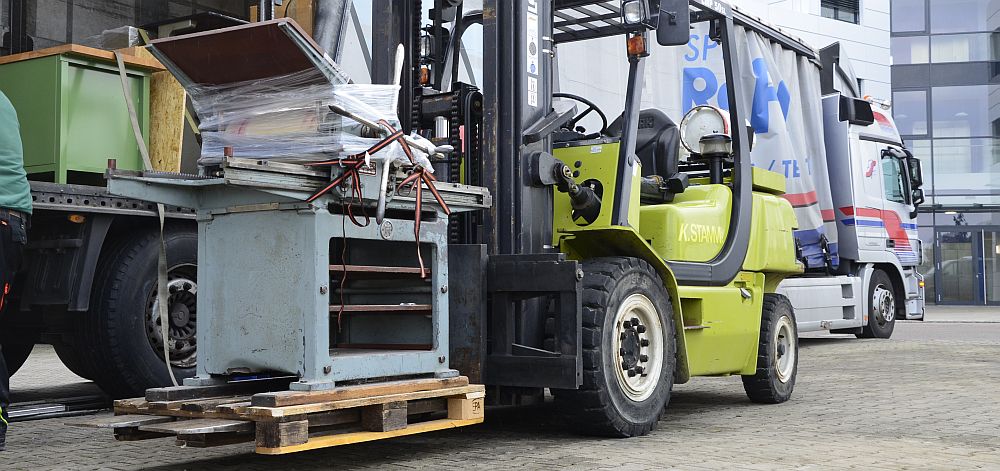
Proofing press on forklift truck

Proofing press on forklift truck

So many stories. Still far from all being told. On Tuesday 18 October early afternoon the articulated lorry reversed back into the yard and parked in front of my old studio’s doors. A forklift truck packed the cabinets and presses one by one on to the truck, which was said to measure 22 metres in length. We agreed to meet again Thursday 8.30am.

Type cabinets safely arrived at their new home

Type cabinets safely arrived at their new home

I was on my way back all Wednesday covering 560 kilometres to our new home, hoping all would be fine. On Thursday the truck was late, stuck in a traffic jam. It got to our new place in Westphalia just after 11am. While the forklift truck was unloading the cabinets and presses it started to drizzle, but never rained. We just so managed to pack almost all cabinets into the barn. Three of them had to go inside with the two proofing presses. There has been no frost so far.

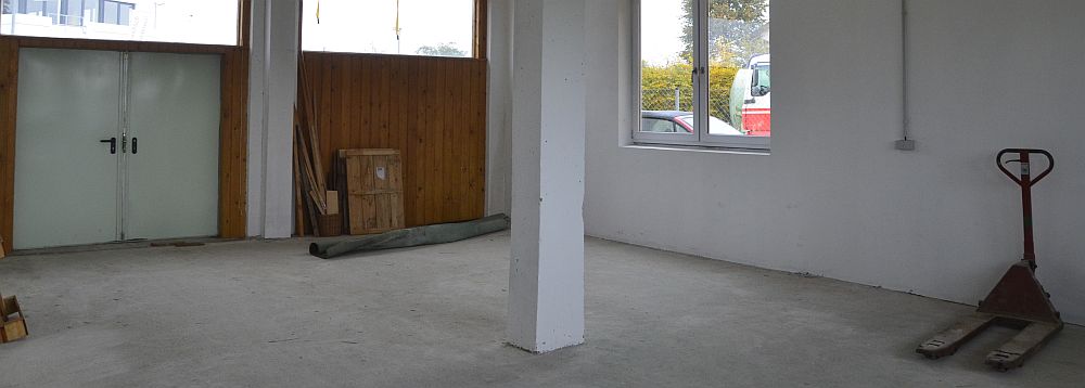
The old place: almost cleared

The old place: almost cleared

As I write this it is cold outside with the occasional shower. Earlier today I have put protective foil to the windows in the printroom-to-be. Tomorrow the plasterwork on the inside walls will start. A number of young shrubs and bushes are waiting to be planted where our garden is going to be. However, I won’t be able to stay that long – the last odds and ends will have to be collected at the old place – this coming weekend.

Autumn evening at the old place in October

Autumn evening at the old place in October

#154sonnets

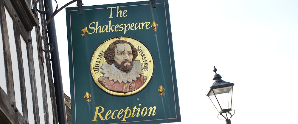
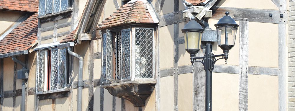
In Stratford upon Avon

In Stratford upon Avon


The Bodleian Library, Oxford (UK)

The Bodleian Library, Oxford (UK)

William Shakespeare died on April 23rd in 1616. By then, besides his plays, he had written 154 sonnets. In 2016, 400 years after his death, the Centre for the Study of the Book at the Bodleian Library in Oxford called artists worldwide to print all of Shakespeare’s sonnets afresh.

bodleian-library-01

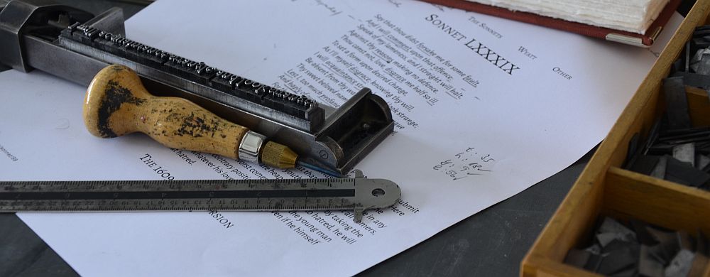
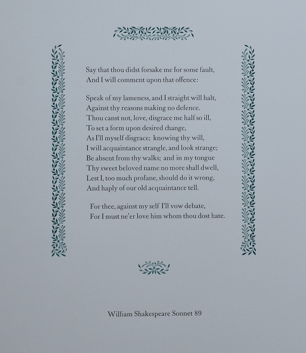
I consider myself lucky that I was given the opportunity to be part of this effort. I was assigned sonnet 89 which reads:

Say that thou didst forsake me for some fault,
And I will comment upon that offence:
Speak of my lameness, and I straight will halt,
Against thy reasons making no defence.
Thou canst not, love, disgrace me half so ill,
To set a form upon desired change,
As I’ll myself disgrace; knowing thy will,
I will acquaintance strangle, and look strange;
Be absent from thy walks; and in my tongue
Thy sweet beloved name no more shall dwell,
Lest I, too much profane, should do it wrong,
And haply of our old acquaintance tell.

For thee, against myself I’ll vow depate,
For I must ne’er love whom thou dost hate.


Stratford upon Avon, Shakespeare's birthplace

Stratford upon Avon, Shakespeare’s birthplace

There have been many attempts to transfer Shakespeare’s works into German. The list of writers and poets who did so, is a collection of many big names: Wieland, Schlegel, Tieck, Friedrich von Schiller, Theodor Fontane, Erich Fried, Peter Handke. There have been others as well. In the early years of the 19th century a group of writers and poets teamed up to accomplish the task: Schlegel, Tieck and von Baudissin. Translating the sonnets proved to be particularly tricky. In 1826 Ludwig Tieck presented a translation of the sonnets. He admitted due to lack of time and his poor health „a younger friend“ had helped. It took some time until it was revealed that the sonnets in fact had been translated by Tieck’s eldest daughter Dorothea. Years later, in 1831, she would write to Friedrich von Üchtritz saying „I believe, translating is a much more suitable work for women than for men, particularly because we are not allowed to produce a work of our own.“

154-sonnets-sketch


Many years ago I came across a book published in Berlin in 1909. The title is „Shakespeare Sonnette: Umdichtungen von Stefan George“. A great poet himself Stefan George did not claim to have translated the sonnets, he tried to write them all over again in German. He kind of converted them. This is how sonnet 89 reads in his words:

Sag, du verliessest mich um einen fehl,
Und ich entschuldige dich für diesen schlag.
Sag, ich sei lahm, so hink ich auf befehl
Da ich mit deinem grund nicht rechten mag.

Du, Lieb, verstössest mich nicht halb so schlimm
Um dem erwünschten wechsel form zu leihn
Als ich mich selbst verstosse .. du bestimm!
So töt ich freundschaft; schau als fremder drein ..

Bin fern von deinen wegen .. nie mehr sei
Dein süss geliebter nam auf meinem mund
Dass ich Unheilliger ihn nicht entweih ..
Und etwa künde unsren alten bund.

Dich schützend stoss ich nach der eignen brust;
Ich darf nicht lieben den du hassen musst.

154-sonnets-00


154-sonnets-01

Being a lover of the English language I decided to print the sonnet in English.

154-sonnets-06

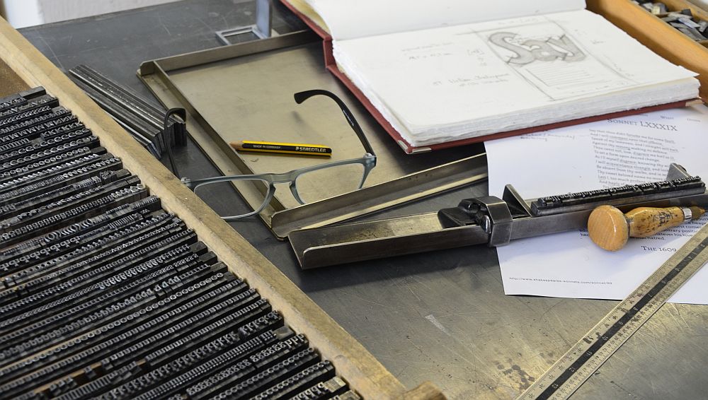
I set out on 29 February driving south for this very special working visit at my studio. Some six hours later I unlocked the door. In the afternoon light streaming in from the windows I could see finest cobwebs dangling from the ceiling. I had not been here since Christmas. I was looking forward to set free the scent of printer’s ink into the air in a couple of days time. This time my stay would be a three week working visit.

154-sonnets-02


Deckle edge paper ready for printing

Deckle edge paper ready for printing

Shakespeare's sonnet 89 in the press

Shakespeare’s sonnet 89 in the press

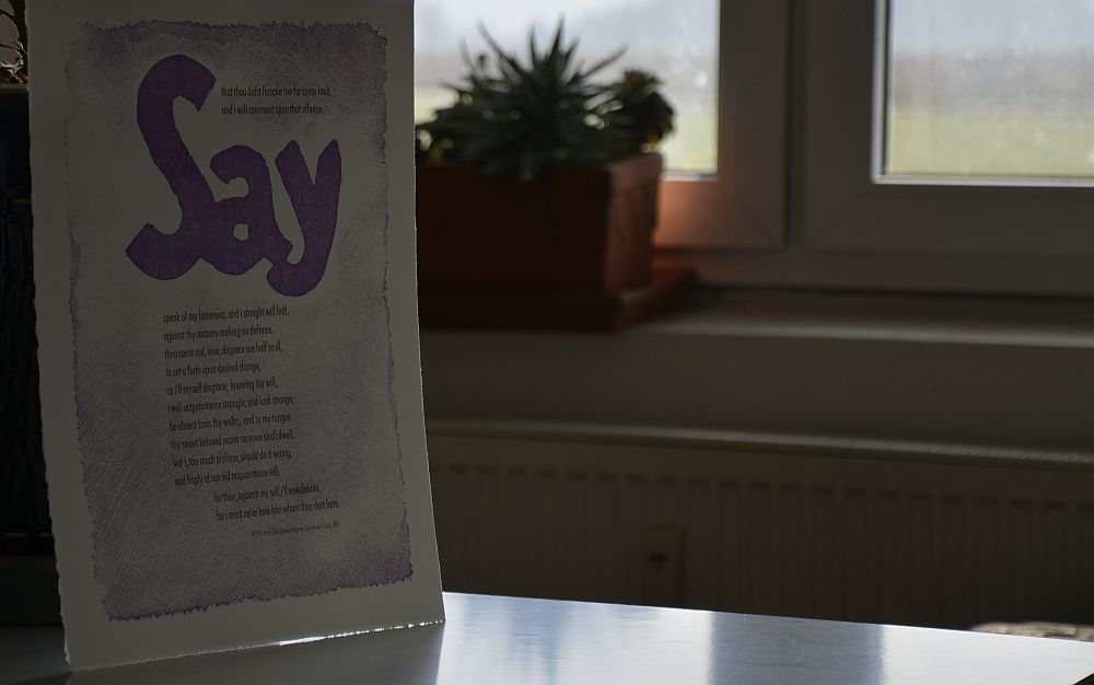
Choosing type can be difficult. I felt the sonnet was like if the writer imagined an argument against him almost in the style of a lawsuit, a trial or court case. To me it sounded like a parol, or the defendant’s last word, confessing it all, pleading guilty on all counts brought forward against him. A court case is something very matter-of-fact, sober. As far away from romatic as could ever be. No story, a report of a status, a plea of guilt. Nothing to it. Pure information, the sheer character. This broke it down to just one fount: Futura. I went to get the case with Futura, 20 pt condensed light. After some consideration I decided to use only lower case characters. In the sonnet it is the speaker’s intension to make himself small as can be, his own will or needs almost non-existent. Or rather: reduced to serving the beloved’s will whole scale. No justification for a capital I whatsoever. The only capital letter being the first letter of the sonnet printed from lino. The sonnet’s text is printed blue, resembling truth in a double sense: speaking the truth and being true beyond all. The linoblock is printed in purple, with the red hinting on the love that still is a bond between them. Printed on BFK Rives deckle edge paper 250gms, made entirely from cotton. Here it is: an avowal.

A first proof.

A first proof.

154-sonnets-05


Shakespeare's Sonnet 89

Shakespeare’s Sonnet 89

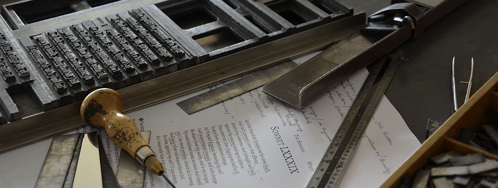
Work finished. I was pleased. I started to tidy up, sort back the type. Sorting back type is something very letterpress, so to speak.
Sorting back type

Sorting back type

A job nobody would think of in times of digital work. A rather unloved job because it seems so unproductive. A task that seems utterly tedious, but needs to be done with utmost care. Otherwise the next time you set out to use this case of metal type, you’ll pay the price with the specimens being in the wrong places. Still, sorting back type can have side effects. It had with me as my mind remained under the spell of the sonnet. I could see another layout, with another typeface, another print altogether. I was mesmerised. I went to get the case containing 16 pt Baskerville. I went for the floral border. I tore the deckle edge paper to size. And there it is: the classic in black and green. The green representing hope. Printed on Zerkall mould made printing paper, white, smooth, 225gms.

Shakespeare's Sonnet 89: the classic

Shakespeare’s Sonnet 89: the classic

I like them both. As I write this, I sit in the kitchen of the old farmhouse where we moved in only a few weeks ago. We have had considerable amounts of rain during the past couple of weeks. While we were staying at Turn The Page Artist’s Book Fair in Norwich severe thunderstorms were lashing through this part of Westphalia. Luckily, the farm was unscathed. Today saw some showers but also brilliant sunny spells that made the pigeons shine like if they were made of pure silver while they were diving into the old oak trees. Their foliage now having taken the heavy shade of green they wear for summer.

In Stratford upon Avon

In Stratford upon Avon

This effort of the Centre for the Study of the Book at the Bodleian Library is ongoing until September this year. More information on this project is to be found on Twitter: #154sonnets, @theBroadPress, @bodleincsb

My Books and Prints with English Roots


In London in the 70s

In London in the 70s

The first time I visited Britain was in 1977. I kept coming back. I remember I had to fill in these forms that were being handed out on the ferry. The note read: „Notice of leave to enter the United Kingdom for Nationals of EEC countries“. In 1984/85 I went there as a one year overseas student, staying at Keele University in Staffordshire. During the Easter vacations I was hiking from Cornwall through Cumbria and Yorkshire and visited Hull and Kings Lynn and some more places – covering the long distances by train. I’ve seen Goathland Station years before anybody knew about Hogwarts. I was staying in Youth Hostels that were old castles with thick walls and, boy, some of the nights were cold. They’d hire out hot water bottles for the nights in one place. I remember getting soaked while walking the perimeter of Beverley. I still keep coming back. I reckon it is not only to do with Walker’s crisps ‚Salt ’n Vinegar‘.

Keele Hall, Staffordshire

Keele Hall, Staffordshire


The Fox - broadside

The Fox – broadside

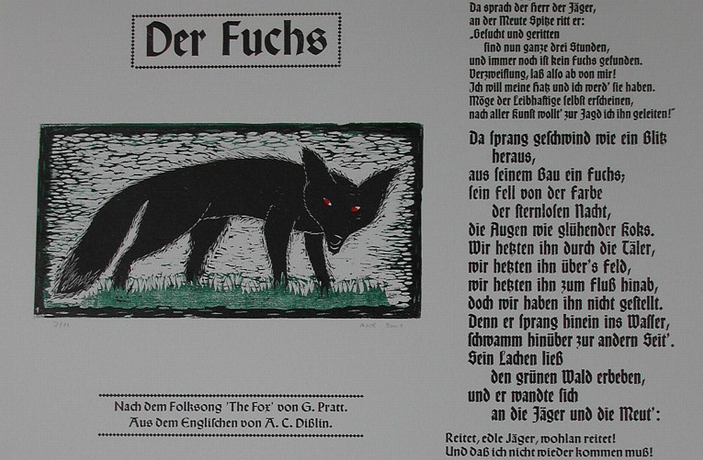
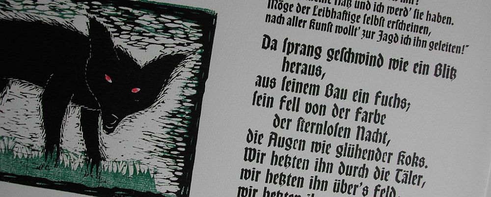
My first work with English roots is a broadside about a little black fox. I heard the story sung to me in the students‘ union at Keele University. The folkband „Falstaff“ was playing there one night. Their song „The Fox“ mesmerised me.

„And there a-sprang like lightning / a fox from out of his hole / his fur as black as the starless night / his eyes were like burning coal.“

the-fox

In 2001 I figured out a German translation trying to keep both rhythm and rhyme (and still making my metal type work out on it). I handset the text from a fount called „Wallau“ and made a woodcut of a black fox with bright red eyes. People kept asking for a separate edition of the fox on a sheet smaller in size, „You don’t happen to have a print of the fox on its own, do you?“. Well, this fox quickly became kind of everybody’s darling. In the folksong the fox is the devil himself. Of course he is astute, but in a very charming way. So, in the end I printed a limited edition of the fox on its own, on strong deckled edge paper.

"Reinecke"

„Reinecke“


Did You Like the Battle, Sir? - broadside

Did You Like the Battle, Sir? – broadside

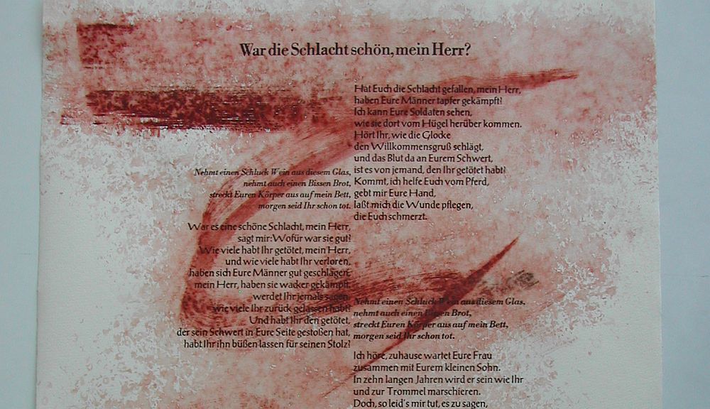
Two years later, in 2003, I started working on a second song of the tape I had bought back at that Falstaff gig.  I felt it was the perfect song to choose as 2003 was when the war in Iraq begun.  The song is called „The Battle“.

„Did you like the battle, Sir, / tell me of its use. / How many did you kill, Sir, and / how many did you loose.“

Originally this song is written by J. Richards and D. Pegg, says the leaflet that goes with the cassette tape.

„Take a sip of this glass of wine / take a morsel of this food of mine / lay your body on this bed so fine / before you die.“

This text is handset from Bodoni. Prior to printing the words I had painted some of the sheets with dye specially made from soil pigments in the colours of earth and blood;  as these would be the colours of a battle. The sheets that went with no paint in 2003 I painted over in 2008.

battle-refrain


Where the Red Poppies Dance

Where the Red Poppies Dance

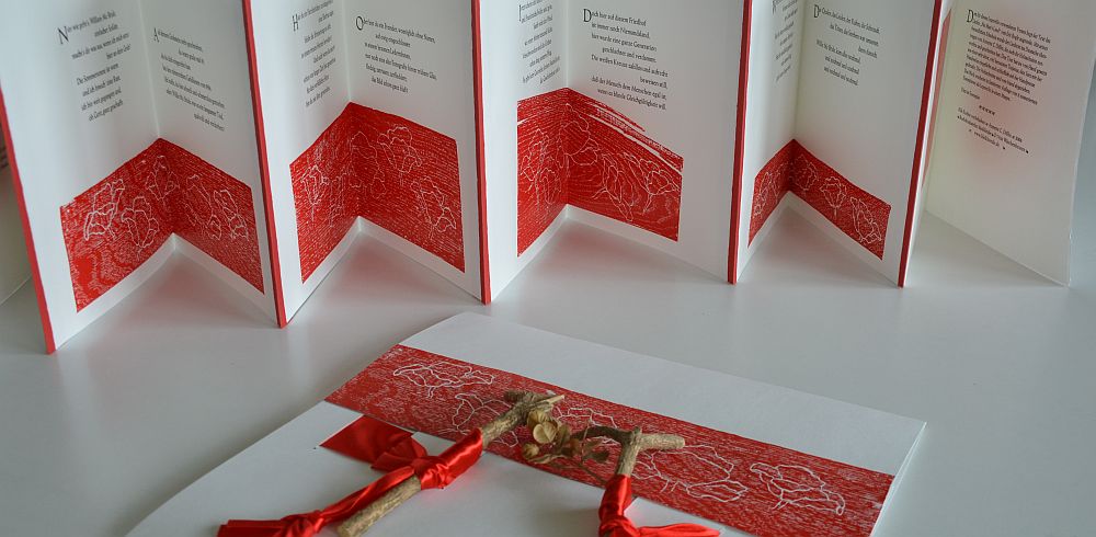
When living in England as a one year overseas student in 1984/85 I had met with the tradition of Remembrance Day for the very first time. I was touched by the way how the consequences of war were dealt with and also by the scale of it. It left me impressed and thoughtful. Years later I came across the folksong „No Man’s Land“ by Eric Bogle. It is about the countless teenage soldiers lost during WorldWar1. I felt the lyrics expressed some very deep truth. As a young man my father had been a soldier in WW2. He was severly wounded, and even though he survived the experiences left him scarred in many ways. I felt I wanted to turn Eric’s lyrics into an artist’s book. I got in touch with Eric in Australia and thanksfully he agreed that I translate his lyrics into German and make a book from it.


Where The Red Poppies Dance

Where The Red Poppies Dance


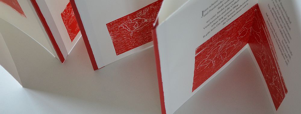
The text is set from a very old and severly worn fount of Trajanus. I deliberately chose this fount because the characters had been kind of wounded during the decades during which they had been used for printing. I felt this connected with what the lyrics were about. I made five woodcuts of poppies dancing in the wind. The blocks are oak wood. They were torn and slighlty faulted so I had to print them by hand instead of in the press. I made the book a concertina folding. I wanted it to display the whole text when folded out completely. It is a strong deckled edge paper and I used a special paper in poppy red to connect the sheets.

The book itself is housed in a portfolio with a latch made of box wood and a satin ribbon in poppy red. I chose box wood for its widespread use as a border around graves and for its symbolic character, beeing connected with eternal life. The work is an edition of 11, relating to the end of WW1 on November 11th, and was published in 2006.

red-poppies-portfolio


Where My Books Go - William Butler Yeats

Where My Books Go – William Butler Yeats

My first artwork in English is the broadside I contributed to the broadside project of „al-Mutanabbi Street Starts Here!“ in 2009. The call for artists asked for a response to the bombing of al-Mutanabbi Street in Baghdad in 2007. In the course of this attack 130 people were wounded, some of them died. The aim of the project was to have 130 different broadsides in the end, one for each wounded or dead person. The text I choose was a poem by William Butler Yeats „Where My Books Go“. It is accompanied by a black woodcut portrait of a lady looking straight ahead. Prior to printing I painted all sheets with my own dye, prepared, again, from soil pigments. I wanted the sheet to look as if it had been torn from the rubble after the attack. Every sheet is unique in its colouring, its brushstroke, in its shades and surface structure – as unique and individual as the people affected in the attack. The project was a success: 130 artists contributed their personal broadsides. One complete set went to the Iraq National Library, many were sold as fundraisers for Doctors Without Borders. And there were more projects to follow.


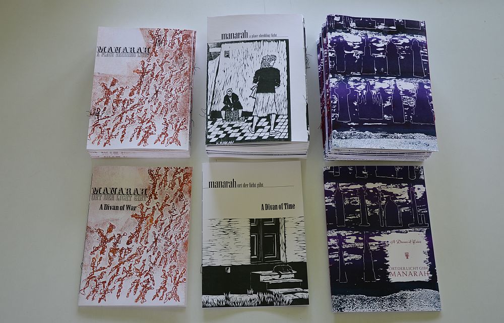
Manarah: issues 1,2, 3

Manarah: issues 1,2, 3


Manarah: issue 1

Manarah: issue 1

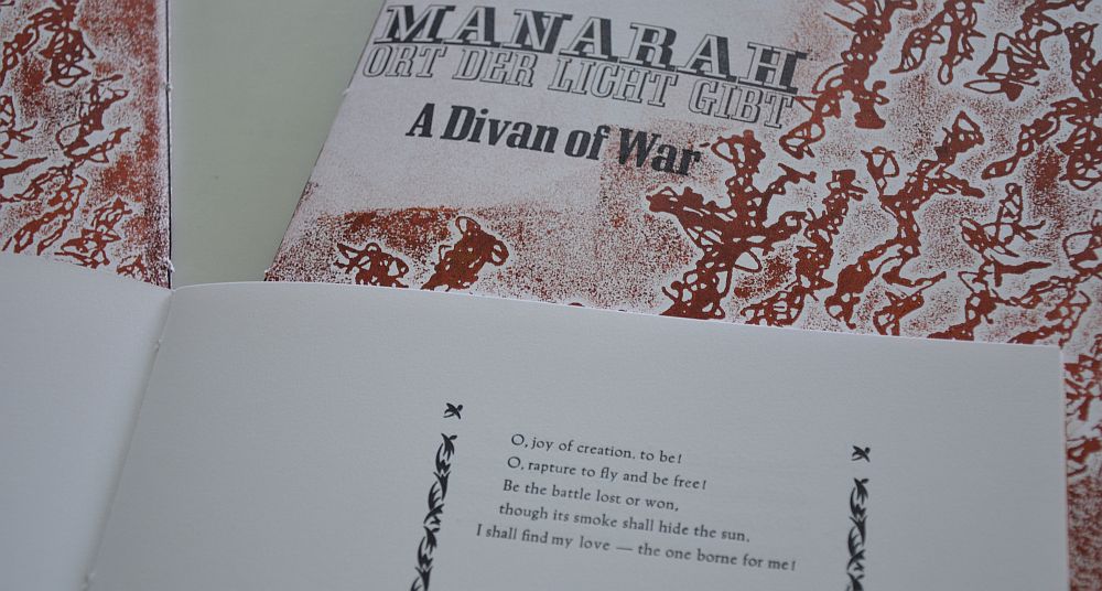
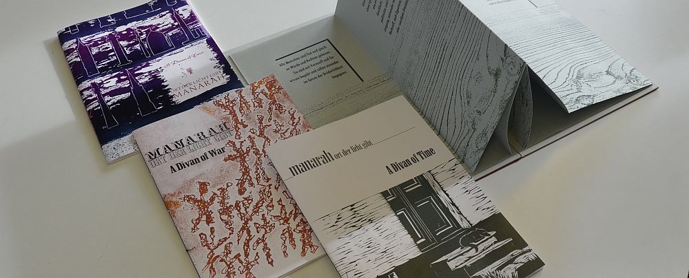
In 2011 the al-Mutanabbi Street coalition sent out another call for artists to contribute. They were to make an „Inventory of al-Mutanabbi Street“. The bomb attack not only took lives it also destroyed books and book stores and cultural heritage. The second project was an attempt to in a sense make up for the loss by creating new artists‘ books of all sorts. Be they dairies or magazine-like structures or large books, notebooks, tiny books – whatever you could think of might have been lost in the attack on a street full of bookshops and coffee houses. I contributetd three issues of the magazine-like work „Manarah“. Like with a magazin each issue deals with another theme. I choose „War“, „Time“ and „Love“ for the reason that it needs love and takes time to overcome war. Each issue is a collection of poetry. All together the poetry covers a period of four centuries of human thought and writing. The poems show what mankind has been suffering from and, also, what people have been wishing for, for a long, long time. „Manarah“ is an old Arabic word and means lighthouse, or more general a place shedding light. In the course of time it was to develop into what we now know as „minaret“.

Lyricards: Dunbar

Lyricards: Dunbar

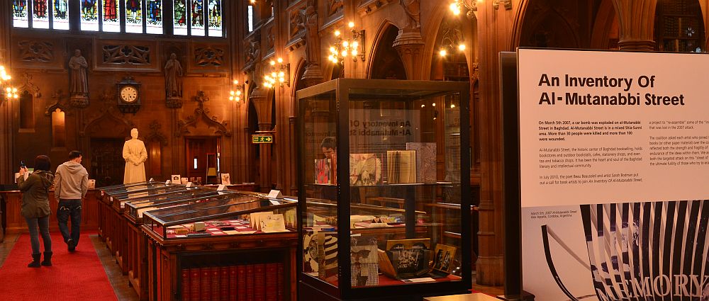
A choice of the poems from the three issues of „Manarah“ is part of the series of cards called „Lyricards“. And a strictly limited special edition of cards was printed as a fund raiser for the project. In 2013 there was a large exhibition of „An Inventory of al-Mutanabbi Street“ at the stunning John Rylands Library in Manchester (UK). The show is touring worldwide.

Lyricards special edition

Lyricards special edition


An Inventory of al-Mutanabbi Street - John Rylands Library, Manchester (UK)

An Inventory of al-Mutanabbi Street – John Rylands Library, Manchester (UK)


Artist's book "Cumbria"

Artist’s book „Cumbria“

Artist's book "Cumbria"

Artist’s book „Cumbria“

During my travelling in spring 1985 I visited Cumbria. I was staying in Keswick Youth Hostle which is right on the banks of river Greta in the town centre. And of course I’d read „The Guide to the Lakes“ by William Wordsworth. „Cumbria“ is a small book published in 2013. It comes with 5 woodcuts and text passages from Wordsworth’s lovely 19th century writings. All sheets are painted prior to printing back and front. The text is handset from Trajanus. It is a small edition of only ten numbered and signed copies. The cover is made from mat with a cutout window. This book is completely in English.

Artist's book "Cumbria"

Artist’s book „Cumbria“


Greno printing office in Noerdlingen

Greno printing office in Noerdlingen

Greno-monotype

Just a two hours‘ drive to the east from where we used to live and only a few miles into Bavaria there is a small town called Noerdlingen. Until a couple of years ago you could find Greno printing office there. The building used to be a stable not far from the town centre. After being refurbished it became a stronghold of letterpress. Mr Buser, who was running the office, also kept a number of Monotype machines. When we went there to visit him he offered us the opportunity to cast our own type. Without hesitation we went for it. Well, to be honest: my husband was as passionate as he was excited about the Monotype casting process, which I was too, but still I opted for sorting the type into the cases, letting my husband have the joy (and excitement) of casting. Trying to print English text using German founts is tricky. Why? Because there are so many ‚y‘ in the English language. German hardly uses any. By casting our own type we could adjust the frequencies of characters to our own needs. It goes without saying: that was exactly what we did. Between 2000 and 2003 we went there again and again to complete our stock of Baskerville.

52 Weeks

52 Weeks

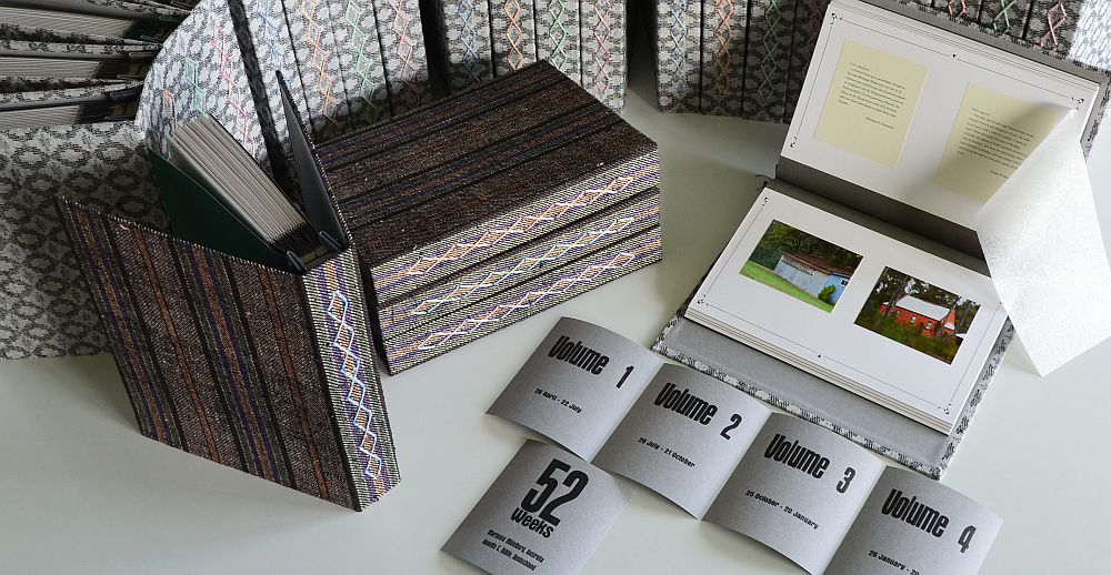
In spring 2011 Marianne Midelburg, living in Australia’s state of Victoria, and I decided to make a book together. We agreed to each take one photo per week for the period of one whole year. Also, we wrote a short comment to accompany each photo. This was the idea for the book that would be published in 2014 by the title „52 Weeks“. The book itself comes in four volumes, each volume covering 13 weeks. All comments in this book are handset from Baskerville, the very metal type we had cast ourselves some ten years ago. Marianne’s comments are in English, mine are in German, but there is an English translation enclosed in a bag in volume 4. The book is being described in two earlier posts on this blog. If you just give the Photobook category a klick or the Artist’s Book category, that’s where you find more on this piece of art work.

52 Weeks

52 Weeks


Woods in Winter

Woods in Winter

„Woods in Winter“, published in 2014, is one more book completely in English. It is a pamphlet stitch book with two linocuts and a poem by Henry Wadsworth Longfellow printed on deckled edge papers. As the poem focuses on winter, the book is kept mainly in cold colours like whites and blues. The endpaper is a sheet of white glassine paper with a pattern of ice crystals. The thread used for the pamphlet stitch is blue. The cover is printed from an old wooden board. This book, too, is a very small edition of ten numbered and signed copies.

Woods in Winter


away-ks-DSF0682

As I write this the Fine Press Book Fair in Oxford is only days ahead. My new book will be out there, hot off the press – so to speak. This book, as well, is completely in English. Its title is „away“. Away-ness has become a very present if not dominant feature in my life over the past couple of years. Right now my presses and metal type are some 500 kilometres away from where I currently live. Away-ness can be a temporary phenomenon or lasting for ever. The book is all about the various aspects of away-ness. I did all the composing and printing work during a working visit at my studio in early October. Each book comes with an individual choice of 12 photographs, making the work an edition of 12 numbered and signed one-offs. The first copies will be on my table at the Fine Press Book Fair at Brookes University in Gipsy Lane, Oxford on 31 October and 1 November 2015.

OxfordFinePressBookFair2015-q


My Books 2000-2015 – Part 2: Typographic Books


Fernöstliches Schmausbuch

Fernöstliches Schmausbuch


I consider myself lucky in that I have a huge stock of metal type to work with. I started off with two cases of metal type way back in 1998. One was Victor Hammer’s Uncial, the other was a well filled case of 10 pt Optima. Over the past years the stock grew to around 100 founts. It really is a treat to have so much choice. However, when it comes to relocating this will make up for a heavy load.

schmausbuch-lebenskraft

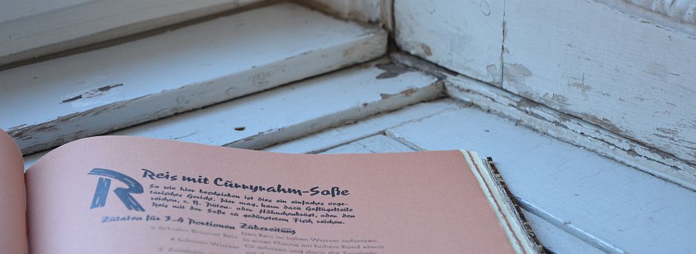
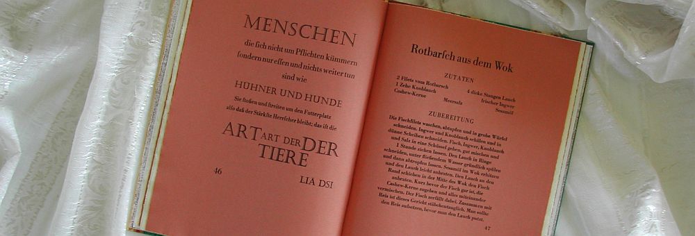
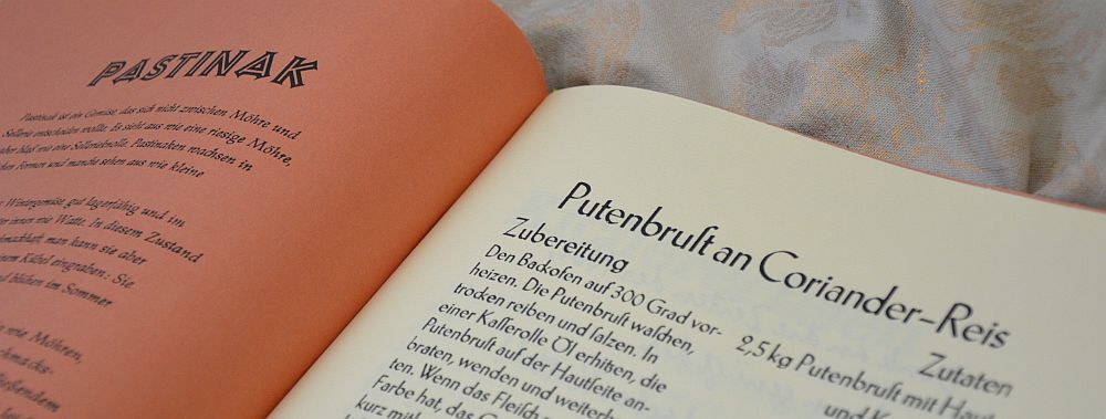
The first typographic book I made was a cookbook. As you can imagine, it was unusual in many ways. I love cooking, I enjoy philosophy and I am fascinated by founts. This easily sums up to a cookbook with philosophical texts, designed using a variety of different founts.

schmausbuch-art-der-tiere

All recipes in the book are of Asian style in that exotic spices like ginger, cinnamon or curry are used. And all recipes are accompanied by an aphorism or a philosophical tale taken from Asian wisdom, like the thoughts and writings of Confucius and many others (with one ancient Roman thinker having wormed himself in). All the philosophical texts are in some way or other to do with eating and drinking or with what people relish. The book comes with some 20 recipes, printed with some 30 different founts. I printed the book in 2002 and I used most of the metal and wood type I had on stock back then.

deckled edge paper in the colours of cinnamon and ginger

deckled edge paper in the colours of cinnamon and ginger

The recipes, of course, are those we used ourselves. It is quick as well as sumptuous meals, vegetarian dishes as well as some with fish or meat, and there is one dessert right at the end of the book. I used Zerkall deckled edge paper for the book in the colours of cinnamon and ginger refering to the ingredients used in the recipes.

Peacock cover

Peacock cover

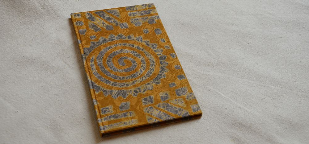
There were three different covers, made from specially chosen fabric related to the recipes‘ ingredients. One cover fabric was striped in the colours of exotic spices, one was a brown-beige fabric with a pattern resembling the ornaments on blankets used on elephants, and one was a chocolate brown fabric with a very sophisticated design of peacocks, whose home is in Asia and India. The book sold out a couple of years ago.


book-mirabeau-cover-DSE9558

My second typographical book is a response to the beginning of the war in Iraq in 2003. I came across a speech of Honoré Gabriel Riquetti, comte de Mirabeau. He delivered this speech on August 22nd in 1789. It is on religious tolerance. Of course, back in those times, it would all be about the hostilities between Roman Catholics and Lutheran Protestants. But it can be read in a far wider sense. Basically, what Mirabeau says here holds true for all sorts of religious thoughts and the strains between them. The quintessence is that we all can co-exist. We can be braod-minded towards other peoples‘ religion and still sleep peacefully. There is no need for killing each other for religious reasons.

book-mirabeau-DSE9563

Taking into account that Mirabeau was an 18th century person I chose Baskerville for the text, as it is an 18th century design. I used paste paper as endpapers. The pattern is an 18th century style made by Susanne Krause in Hamburg, who specialised in making paste paper for restauration purposes. The cover is made from an African batik fabric. The design has been printed by hand on a delicate damasc fabric. The book comes in an edition of 16 copies, one of which is still for sale.

book-mirabeau-finis-DSE9564

Mirabeau had been involved in the process of discussing and designing the Declaration of Human Rights. That was the particular context in which he delivered his speech on religious tolerance.

menschen-wuerde-rechte

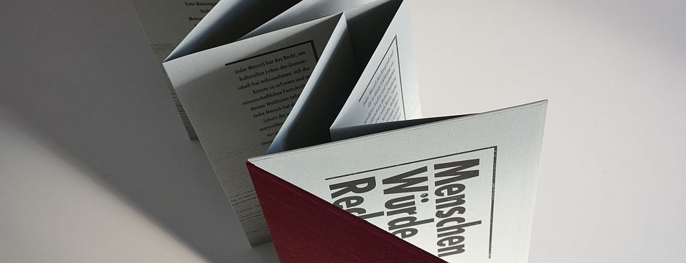
In 2005 I chose a number of articles from that declaration and made an exclusively typographic book. There was only one fount I could think of using for this book: Futura, as austere as beautiful. I wanted this book to be special in a number of aspects. I wanted its character to mirror the long-term validity of the articles in the declaration. I wanted the book to have something sovereign to it; it was to express duration and hope. First of all I chose a strong paper of green colour, since green is the shade of hope. I printed on it the grain of an old weathered wooden board, rubbing it off by hand. In this grain every single year the tree has been living has materialised, thus it is like time becoming observable. I printed the text from Futura to stand strong for itself. I gave the book a cover from kingly red silk, expressing its sovereignity. And I made the book a concertina folding whose pages can be turned and turned endlessly. While turning the pages the book will be set in motion like if it had a life in itself. Additionally, the book can be stood on a plinth. The book’s title is „Menschen Würde Rechte“ (Men Dignity Rights), it is an edition of five. The work was accepted at the new Bibliotheca Alexandrina in Egypt for their second Biennial of the Artist’s Book in 2006. One copy is part of their collection.

manarah-human-rights

In 2009 I became aware of the activities of the al-Mutanabbi Street coalition when I met Sarah Bodman at the book fair in Hamburg. Almost instantly I joined in with their broadside project. In 2011 there was a call for artists to join the „An Inventory Of Al-Mutanabbi Street“ project. I developed the idea of the magazine-like works by the title „Manarah“. I had been doing research around this theme for some time, following the Swiss voting against minarets being built within their country. Manarah is an old Arabic term describing a place that sheds light, literally and in a wider sense. In ancient times this would have been something like a signpost or a lighthouse or whatever device to guide people on their journeys. However, over the centuries this term would develop into what we now know as minaret, the typical tower of a mosque.

Manarah - Issues 1 to 3

Manarah – Issues 1 to 3

My work „Manarah“ resembles a magazine. I decided to have three issues. Each issue is a collection of poetry on a special theme: war, time and love. Alltogether they span a period of some 400 years of human thinking about these themes. As this work is partly in German and partly in English it will be described in the upcoming post dealing with all my works related in whatever way to the English language. There is a special blogpost in the category „Artist’s Books“ dating from December 2012 describing „Manarah“.


Poetical Rose Book

Poetical Rose Book

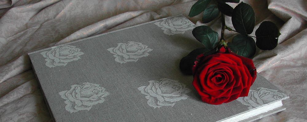
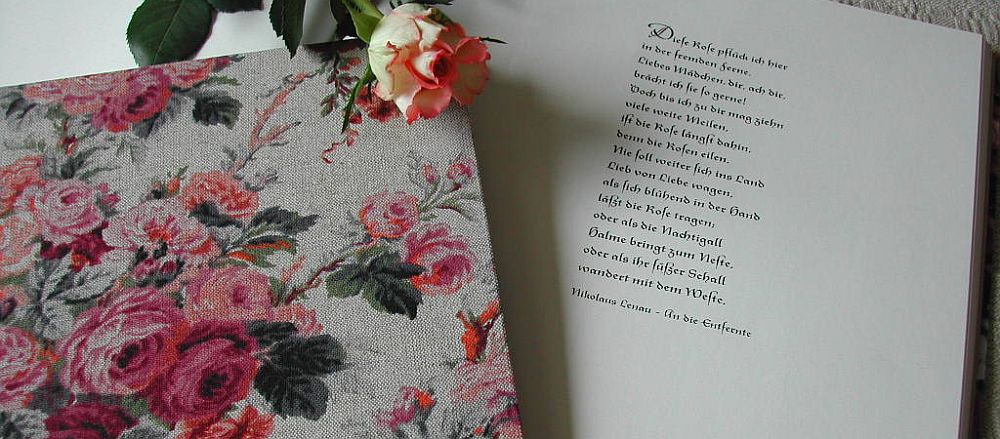
My Poetical Rose Books are utterly different in almost every respect, and they were deliberately designed to be that way. The most normal about them probably is their binding. Depending on their size they come with either seven or nine poems. All poems are dealing with roses in one way or another. And all poems are written by well known German poets like Heine, Hoelderlin, Theodor Storm and colleagues. The total number of pages in each book varies according to size and making between around 90 and 152. Understandably these books come with a good number of blank pages each.

Poetical Rose Book

Poetical Rose Book

Poetical Rose Book

Poetical Rose Book

Each book is meant to be completed by its owner. There are many ways this can be done. Gardeners fond of roses could use the book as their garden diary. It could be used as guestbook on a special occasion like a wedding anniversary. People writing poetry themselves could fill the pages between the printed poems with their own poetry. These books are a series of 20 one-offs. Every book’s cover is made from a special fabric with a design related to roses. Every book is unique.


tucholsky-DSD_3413

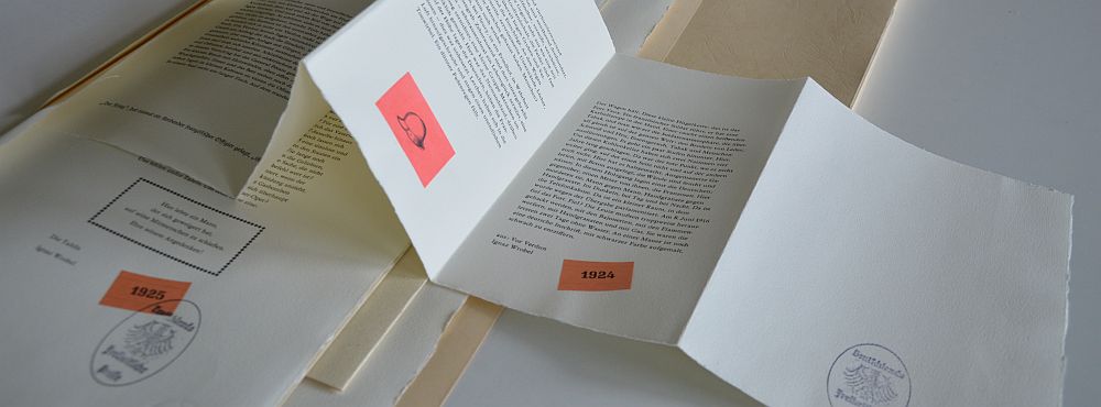
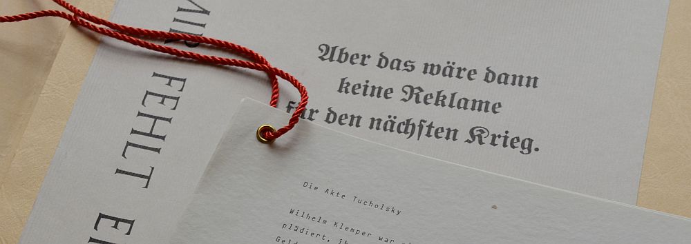
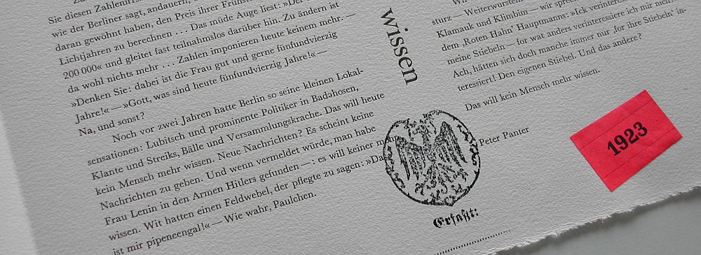
My artist’s book about Kurt Tucholsky is a very special work without doubt. It is purely typographic apart from there having been used some old clishees. There is a special blogpost dating back to July 2014 when there was an article on the book in Matrix 32, plus another one dating back to December 2012 in the category „Artist’s Books“ describing the work.

Mir fehlt ein Wort (I lack the word)

Mir fehlt ein Wort (I lack the word)

I fell for Tucholsky’s writings way back in the 1980s when still a student. He was a writer and essayist in Weimar Republic. His mastering the German language is outstanding. He saw a second World War coming. He opposed Hitler’s party as much he could. His writings are as relevant and disturbing today as they were back in the 1920s and 1930s. He pointed out that socialists and communists faced much more severe sentencing at court than conservatives and fascists. He described how economic networks, particularly concerning the fire arms industry, had their own notion about wars paying off for them. He pointed out that as these industries made their profit by selling weapons, they quite naturally had a dislike for peace. He got stripped off his citizenship by the Nazis in 1933 and took his own live two years later in his Swedish exile.

tucholsky-Ms-Lenin

The very special feature of the book is that it is entirely made of spoiled sheets. The idea being that a young printer had collected those spoils from the waste bin at his Berlin printing office and taken them home to make a good read. He’d collected the texts he liked most in three portfolios. After him fleeing Germany for America in 1933 these portfolios end up on the desks of the Nazi party and thus were turned into files used for prosecuting and expatriating Kurt Tucholsky.


Meine Worte fallen wie Steine (My Words Fall Like Stones)

Meine Worte fallen wie Steine (My Words Fall Like Stones)

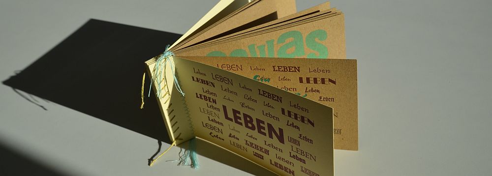
My so far newest book is entirely typographic. Also, it is of a very experimental sort of typography. Contrary to that typography originally is supposed to aid and support reading and understanding the text, here typography impedes reading, it disrupts and interferes with understanding.

book-meine-worte-DSE_7399

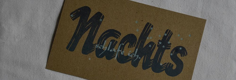
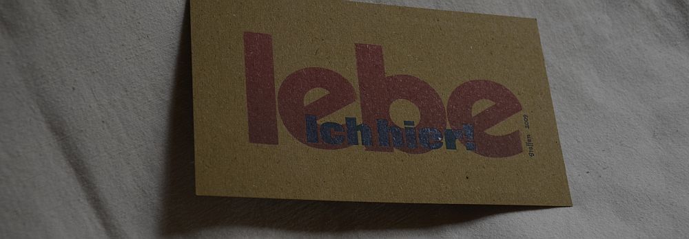
This specific typography wants to make aware of our preoccupations. It wants to make us learn that we so often do not read what is written or printed but instead what meets our expectations. We are unaware of us being convinced we know the text without reading it. We reckon we can guess, and we rely on our guess being correct. The book comprises of 14 postcard-like prints. Each of them comes with one sentence. Next to the sentence a name and a year are given. All sentences have been spoken to me in real at one point in my life, in some sort of context. The context, of course, is not revealed. Readers are free to make up their own ideas of what sort of context this might have been or could be. The books are sewn in a modified way of Japanese binding. The cards are printed on a rather aged quality of brown cardboard. Covers are made from strong cardboard material in different colours. The book’s title is „Meine Worte fallen wie Steine“ (My words fall like stones). It is a series of 12 one-offs. These books are not numbered nor are they signed.

card-meine-worte-DSE9567

card-meine-worte-DSE9572


There is a blogpost dating from December 2012 by the title „My Type“ which in a way is about my stock of metal type.