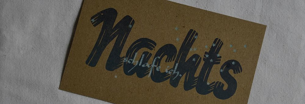
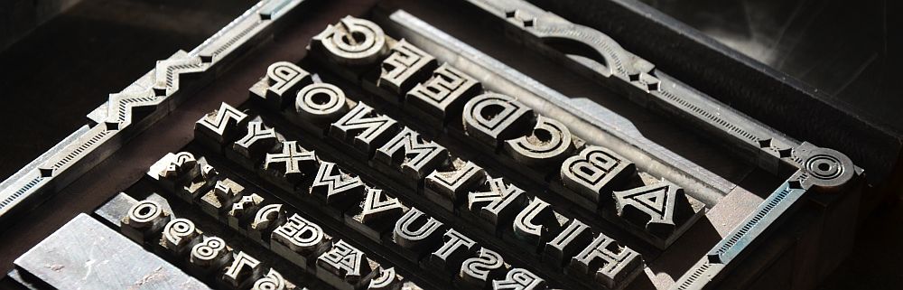
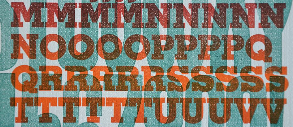
Movable type
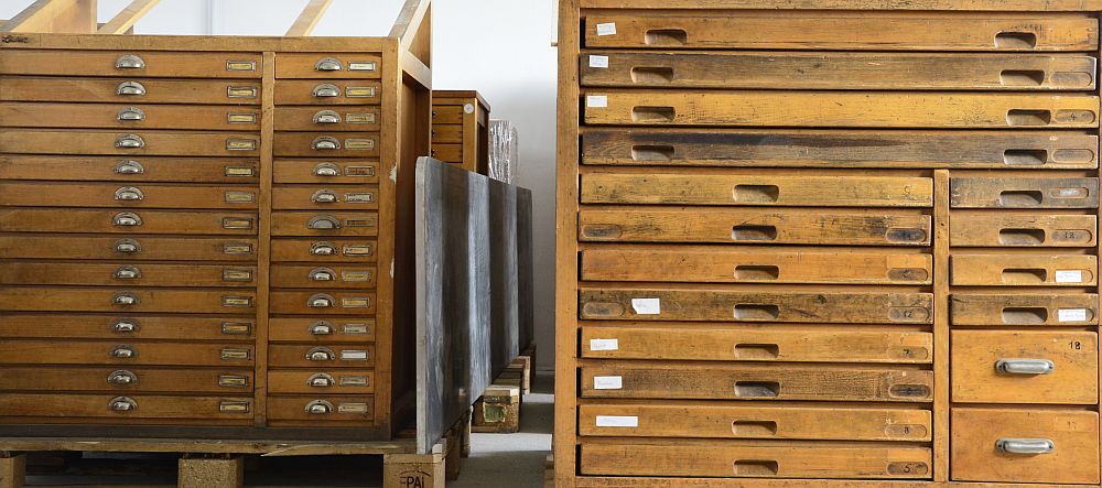
Moving tons of metal type and printing presses is a hard job to do, no matter what time of the year. However, there was one thing I absolutely did not fancy: having to move my type and presses during the winter months. When in August I realised that all the type cabinets might fit into our barn for short time storage, I considered moving the lot during October. The printroom is still far from being finished, but it might be ready to use some time in December. Having all the printing gear at hand, would mean it can go in there the moment the paint on the walls has dried. Dates were fixed and time went quickly. Add to this: it went cold.
Memphis
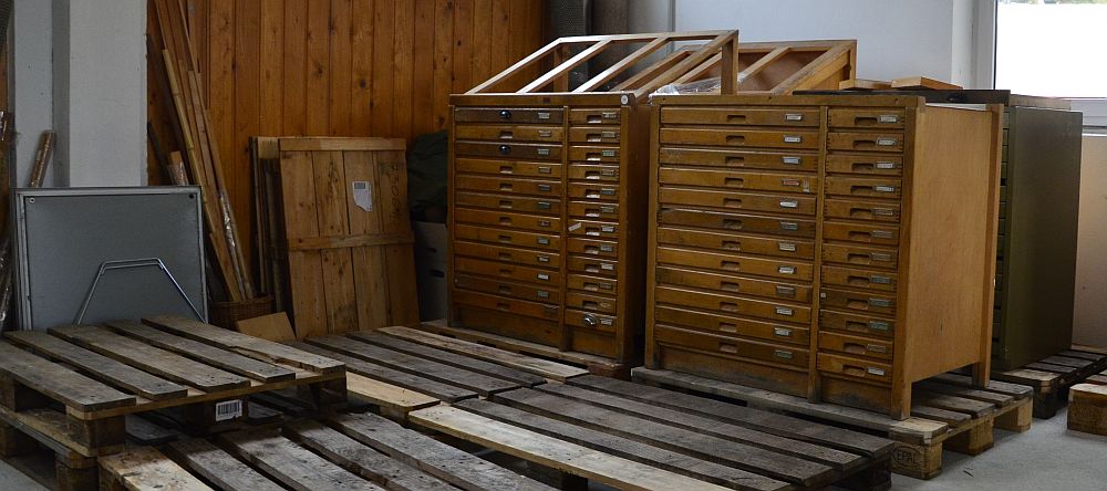
First cabinets on pallets
I drove south again on 10 October. I had just about one week to shove all the type cabinets on to palettes and thus get them ready for transport. The articulated lorry would come to pick it all up on 18 October. Packing up stuff is a peculiar job. Each piece you pick up, shove around, wrap in bubble foil and strap to a palette comes with its very own story, be it long or short. Some of those stories you had forgotten about, others you all of a sudden realise you had not even been aware of.
I have a small number of oversized type cases. In German they are called „Brotschriftkasten“, which literally means case of bread type. The reason for this was: the larger cases held more type specimens and were used to compose long texts. It was these cases that helped the printing office make its core income, hence the name bread type: the type that payed for the bread. I kept one of these cases, housing a rather old and worn type, sitting on top of one of my older type cabinets. Normally the cabinets would have been made of beech wood. This one was made of fir or spruce and it looks rather bashed-up. My landlord helped me lifting the case off of the cabinet and place it on another to be strapped in for transport. Only when I started taking the cases out of the old cabinet I became aware of a label that was pasted on to the wood. It was an old rail transportation label stating that this piece of furniture had been on its way from the main station in Stuttgart to its destination on 12 April 1928.
This cabinet was travelling in the times of the Weimar Republic, when Kurt Tucholsky was still alive and writing, a decade before the start of WW2. It reminded me of meeting a printer once at a fair. He was running his own printing office which had been a family business for at least three generations, perhaps more. Both, his father and grandfather had seen all their type taken away more than once by the military during war times – to be made into ammunition. I could almost feel his disgust about such an utterly savage act. Type was the medium that had made possible and helped spread education, knowledge and understanding. With printed books and leaflets people could learn each others languages, could descry other peoples‘ culture and art and customs and recipes. Metal type was a means of understanding, a means of crossing borders and connecting people. „This is a printing office, crossroads of civilization, refugee of all the arts against the ravages of time …“ You can almost hear Beatrice Warde’s words (dating back to 1932) ringing in your ears. You can hardly imagine anything worse than turning metal type into ammunition to kill off people. Nevertheless, it has been done again and again.
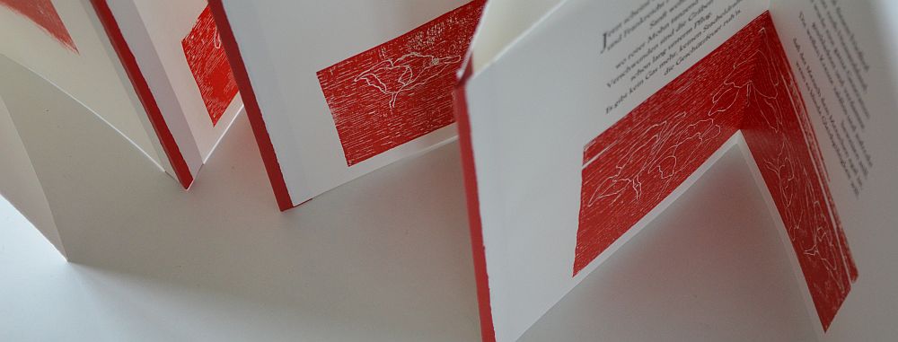
Where The Red Poppies Dance
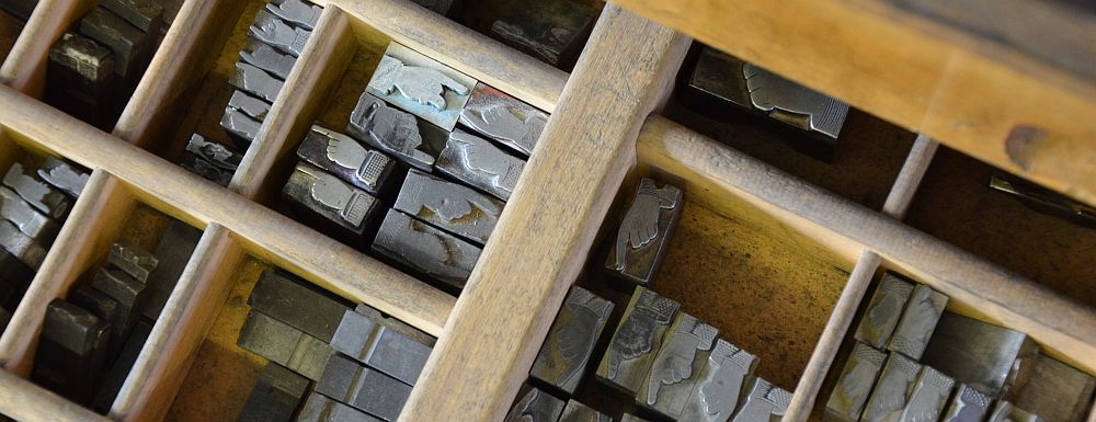
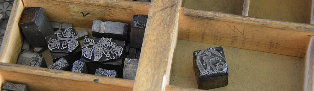
Another of my very old cabinets is the one housing the small family of Trajanus, the fount I used for my artist’s book „Where the Red Poppies Dance“. It is the type of cabinet that comes with four oversized cases plus ten normal size cases and ten narrow cases for larger type. On the Sunday my dear friend Ivonne came to help me all day. A more than heartfelt thankyou goes to her. It is totally her credits that I managed to have all cabinets ready for transport by the following Monday evening. I would not have been able to achieve this without her tireless effort. We took out the large cases and discovered a nest neatly made by one of my furry visitors. What a thoughtful choice! Trajanus is one of my favourite founts and here we were: The specimens of the 9 point lower case ‚d‘ had been snuggled into a neat and cosy looking circle and cushioned with little snippets of paper – part of which had been labels in another of the cases, containing ornaments. But there was still more to come.
Somebody made themselves at home in Trajanus type
When we started to take out the cases in one of the other cabinets, the meanwhile homeless mouse was sitting there staring at us. It had started building itself a new nest on the floor beneath the lowest case. It was a very beautiful mouse, though, with a nice long tail and lovely spherical black eyes. We tried to catch it but with no avail. It took flight and appeard to have vanished. In this place I’ve seen a number of furry visitors and feathery ones, too. Normally I was able to return them into the wild where they belong and are happy. I have no idea what happened to this one. It might have taken its chance to travel to a new place. If so, I’m sure it will love our barn and not regret its decision to cling on. That is, at least until its first encounter with one of the martens that live here, or for that matter our neighbour’s cat.
I should have known, but it still came as a surprise that there were so many cases so heavy weight. A few of them were the ones coming with Baskerville. In my first couple of years we were given the opportunity to use a colleagues Monotype caster to cast our own type. We chose to cast 10 point Baskerville. And we decided to cast more than normal, to make it our bread type, so to speak. But there were other cases full to the brim, too.
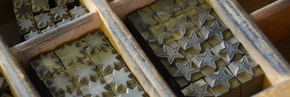
During this one week I was taking out each type case from each cabinet and putting it back in after the cabinet sat firmly on its palette. I saw them all once again. The ones that I have used often and the ones I always wanted to use and up to now never found a suitable project for. I saw all the ornaments, decoration, borders and clichés. I cut up my old worn needle felt carpet from the floor to use it as padding in the cases.
Old carpet as padding
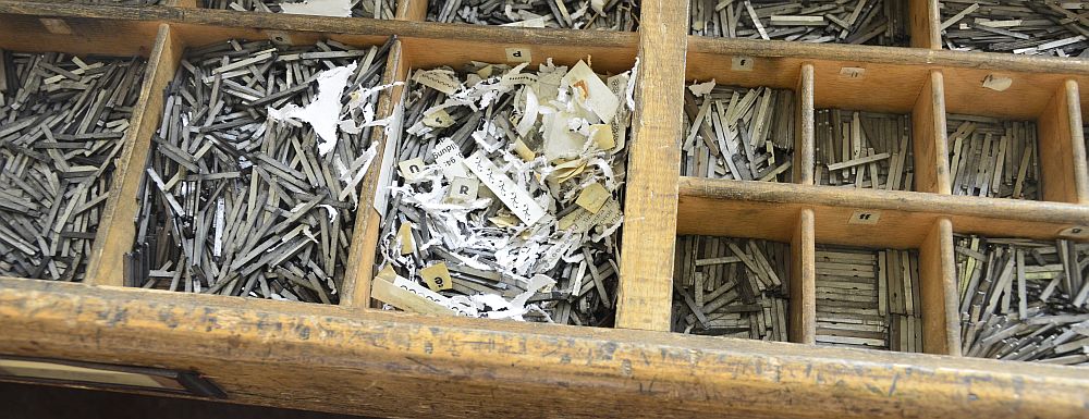
On one day I came across two cases that were amongst the first I had bought. The owner had been a photographer, running his own shop and, in a way, publishing house. He produced a number of series of postcards. One edition pictured locations where hill walkers and hikers would go to, particularly the pubs or snack bars there. The other edition was of famous people of the time, singers and actors mostly. He would take the photographs produce the prints from them and then print a small text on the back of the postcard. The text would either be the name and details of the person or the place and elavation of the location depicted. He also produced autograph cards that would be signed by the singer/actor.
Since he was neither a printer nor a composer he used his type in a somewhat unorthodox way. He compsed the text, printed it and kept it for using it again. Basically this is what printers would have done. But a printer or composer would not have used cellotape to keep the set type together. He did so, with the effect that over the years the glue became somewhat half-solid and almost un-removable.
Add to this, while keeping all his old text bits, he gradually ran out of type. He must have kept ordering more over the years or decades, but at some point the type he had started off with would be out of stock at the foundry, or given a re-design. Quite obviously he decided to take one similar to the one he had putting it in with the rest of the old. After so many years he ended up with at least three or four different sorts of 8 point type in one case. We had tried to sort it, but given up on it. There was no way of ever working reasonably with type like this. I had kept these cases solely for the reason that they were amongst my first. I saw clearly that this was the moment they would go to the scrap metal merchant. Back then I had bought two cabinets from his stock, one of which was a smaller, almost delicate nice little furniture. However, the photographer being a smoker and handling chemicals obviously at the same time, there must have been an explosion of some sort on the cabinet and you can still see the spill of the blast.

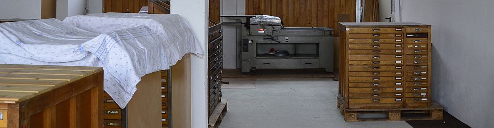
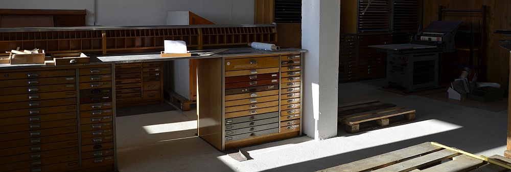
The evening prior to loading
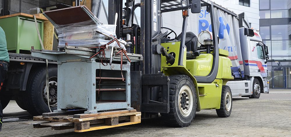
Proofing press on forklift truck
So many stories. Still far from all being told. On Tuesday 18 October early afternoon the articulated lorry reversed back into the yard and parked in front of my old studio’s doors. A forklift truck packed the cabinets and presses one by one on to the truck, which was said to measure 22 metres in length. We agreed to meet again Thursday 8.30am.
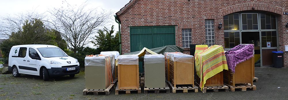
Type cabinets safely arrived at their new home
I was on my way back all Wednesday covering 560 kilometres to our new home, hoping all would be fine. On Thursday the truck was late, stuck in a traffic jam. It got to our new place in Westphalia just after 11am. While the forklift truck was unloading the cabinets and presses it started to drizzle, but never rained. We just so managed to pack almost all cabinets into the barn. Three of them had to go inside with the two proofing presses. There has been no frost so far.
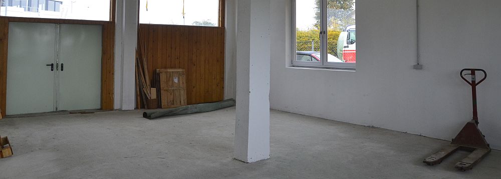
The old place: almost cleared
As I write this it is cold outside with the occasional shower. Earlier today I have put protective foil to the windows in the printroom-to-be. Tomorrow the plasterwork on the inside walls will start. A number of young shrubs and bushes are waiting to be planted where our garden is going to be. However, I won’t be able to stay that long – the last odds and ends will have to be collected at the old place – this coming weekend.
Autumn evening at the old place in October