Artist’s Books in Hamburg: 19 + 20 January 2013

Link

fair-HH-museum-DSCO3524

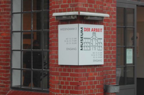
If you’re interested in and love hand printed books and bookarts, then the place to go in January is to North Germany, to the ‘Museum der Arbeit’ in Hamburg-Barmbek.


fair-HH-river-DSCN9043

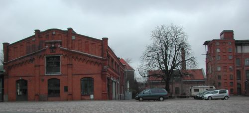
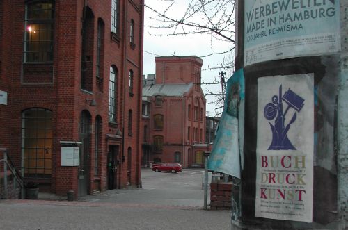
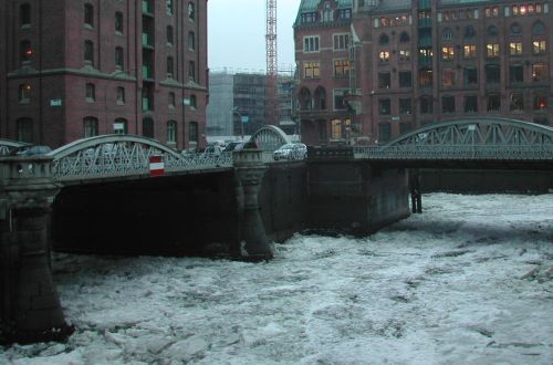
Hamburg is, by itself, an excellent travel destination with all its galleries, museums, historical buildings and public events. In mid January, however, there is a special event for lovers of bookarts: On the 19th and 20th January fifty book artists and printers will gather to display their artwork in the wonderful old redbrick buildings of the former ‚New-York-Hamburger-Gummi-Waaren-Compagnie‘ rubber factory. Founded back in 1871 the factory steadily grew until it was shattered during the WW2 bombing raids. Over the years the remaining sections have been carefully refurbished and are now used as a museum to show the impact 150 years of industrialization has had on the every day life of workers and their families.

fair-HH-poster-DSCO3515

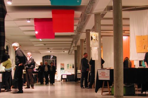
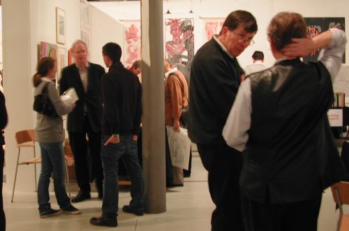
One of the many events held at the museum is the ‚Norddeutsche Handpressenmesse‘. This trade fair brings bookarts to Hamburg–Barmbek, and within walking distance from the Barmbek tube station. With this 2013 fair the schedule changes from a biennial to an annual cycle. From this year on some 50 studios from around the world as well as individual artists will be given the chance to put theirworks on show – and visitors the opportunity to browse them all and buy their favourite books.

fair-HH-2009-DSCN9072

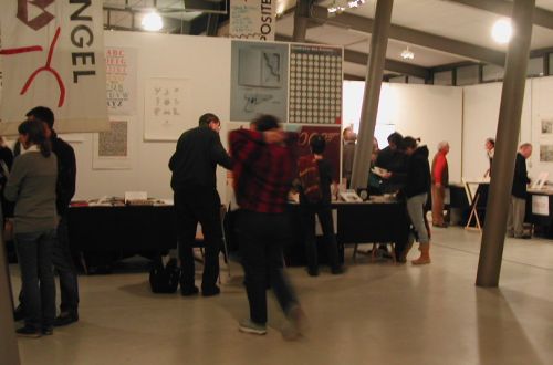
One section of the museum houses, from former times of letterpress printing, equipment which was used in any printing office; namely different types of printing presses, a large stock of metal type and even type casting machines such as Linotype. The experienced and dedicated members of staff know how to work these machines and will demonstrate to visitors how the hard work of letterpress printing was actually done. They will be giving practical demonstrations during the 2 days of the fair. Visitors will have the possibility of not only seeing and holding the finished books, but also watching the different work procedures involved in printing and making a book.

fair-HH-2011-DSCO3509

There will be other events alongside the fair, such as an exhibition of new works by Masters of Bookbinding, Calligraphy and Lithography. Papermaker Johannes Follmer will also demonstrate the art of handmade papermaking. Follmer usually works from his family’s papermill in Triefenstein, which is not far from Heidelberg. Artists can ask him to make paper to order specified for their special printing purpose and even with an individual watermark in every sheet.


One can find all events and a complete list of exhibiting artists and studios at this link: http://www.buchdruckkunst.de


fair-HH-2009-DSCN9073

Click here to find more English language information about the ‘Museum der Arbeit’ in Hamburg-Barmbek:  http://www.museum-der-arbeit.de/Museum/konzept.en.html

fair-HH-museum-DSCO3503

Find the museum’s website here: http://www.museum-der-arbeit.de

fair-HH-winterice-DSCN9059

The fair in 2013 will be open
on Saturday, 19th January from 10 am to 7 pm and
on Sunday, 20th January from 10 am to 5 pm

Information to feed in your GPS:
Museum der Arbeit, Wiesendamm 3, 22305 Hamburg-Barmbek


Where The Red Poppies Dance

When I was a student studying in England in the 1980s I heard about Remembrance Day for the first time. I saw all these people wearing their red poppy flowers pinned to their shirts, jackets or coats. And then I wondered whether they seriously wanted to ‘celebrate’ the horrific First World War that England had been involved in. It took me some time to understand that I had got it quite wrong back then.

When the horrific killing finally came to an end on the 11th November 1918 it left Flanders devastated. Large parts of the countryside had been ploughed over by the massive bombing and the dismembered bodies of thousands of soldiers had gotten mixed with the soil in a way they could not be brought home or even buried in the proper respectful manner. Within days the countryside had turned into a sea of red: millions of red poppies covered these fields of grief and horror. Red poppies are summer flowers; they don’t usually come to bloom in November. On the other hand, a botanist would be able to give a quite unspectacular explanation as to what happened then and why.

However, there’s a bit more behind this. For a very long time the Red Poppy has been seen as a symbol for both Death and Life. People in all their grief, pain and despair, could see the message pinned to the coat or jacket and understand. The still unknown total death toll of WW1 demanded action to be taken for Life and for the living. The Red Poppy became the symbol for Remembrance Day, a day to remember not only all those, who had fought and died, but also those individuals that had survived wounded; who had lost a limb or their sight. The Red Poppy is also a symbol for the families who had lost a father, a brother or a son, and for the many young women who had lost their husbands, many of whom had only been married weeks or months earlier. The Red Poppy reminds us of the tragedies any war can bring. This simple red flower is a warning to always be aware and be prepared to take appropriate and timely action against looming conflicts.

In 2006 I asked Scottish-Australian folksinger and songwriter Eric Bogle if he would give me the permission to translate his song ‚No Man’s Land‘ into German in order to make an artist’s book. He immediately gave me permission. I loved his lyrics and very much enjoyed translating them into German. Then I made 5 woodcuts of Red Poppy flowers dancing in the wind over Flanders. The finished result is a concertina-folding type book; the sheets of the deckle-edge paper are connected with poppy-red folds. The woodcuts are rubbed off by hand and printed poppy-red. I used blocks of oak wood that had cracks and an interesting wood grain, giving a most pleasing texture.

The song text is set by hand from a very old and much used metal type: Trajanus. The book is housed in a portfolio with a clasp made of poppy-red ribbon and Boxwood twigs. Boxwood was very commonly used as a border of graves, symbolizing eternal Life, everlasting true Love and the overcoming of Death. The edition is signed and numbered and limited to 11 copies relating to the particular date and time of the 11th November at 11 o’clock in the morning when the guns finally fell silent.

Find more here: http://www.bleikloetzle-goes-british.de/html/red_poppies.html
including a link to Eric Bogle’s original lyrics and a reference for further reading.


Manarah

Manarah is an old Arabic word for ‘lighthouse’, a place of light to help those on a voyage find their way. Later the word developed into ‚minaret‘ – which is the tower of a mosque. I found out about this a few years ago whilst doing research on this topic. The Swiss populace had just voted not to allow the building of minarets in their country.

I like the image. A lighthouse gives guidance and orientation but it does not take you by the hand. The symbol of the lighthouse does not make it too easy for you. You’ve still got to do the travelling by yourself. You’re still responsible. You are free to make your own choices.

My ‚Manarah‘ is a book-arts magazine printed letterpress using metal type. The first 3 issues were published in 2011. Every issue is a ‚Divan‘, a collection of poetry on a chosen subject. ‚Divan‘ is a Persian word for the collection of poems. I had decided that these first 3 issues would be my contribution to the al-Mutanabbi Street inventory project. This project is one response to the bombing of al-Mutanabbi Street in Baghdad back in March 2009. During the attack the centuries old city district of bookselling as well as literary and intellectual life was totally destroyed. One hundred and thirty lives were lost or injured. An ancient city’s cultural heritage was left shattered. Beau Beausoleil, a Californian writer and bookseller with his al-Mutanabbi Street coalition, has put out the global call to follow the „al-Mutanabbi Street Starts Here“ campaign.

They asked bookartists all over the world to follow their call  and built up a new inventory of books for al-Mutanabbi Street by making 3 works of bookart each.

The 3 themes I choose for my three issues were: war, time and love. I felt it would need love and take time to overcome the destruction and suffering caused by war.

From the time when I realized that there was something the adults called ‚News‘, this News was usually about war and death. During my childhood and teenage years there were wars and conflicts in Belfast, Lebanon and the Near East and in the Basque country of northwest Spain. Of course there were other wars and conflicts elsewhere, but these were the theatres of war I remember during my formative years. Some of these wars went on for decades; many of them are still no closer to a peaceful resolution. Thousands of children, born in these places, die during a bombing raid or get caught in sniper fire. If they survive they lead a life of permanent threat, danger and hatred. They could lose any of their family or friends at any moment. It becomes almost impossible to lead a normal life, have a proper education, earn a decent wage, build up a career, raise a family or even build a small house. How can one lead a normal life, when everything can be taken away from you at any moment?

I feel the deepest respect for any person who grew up during a war or a regional conflict and who will stand up for peace. Someone, who will still make every effort to stand strongly against hatred and against the lies and distortions of the truth of war; someone who is convinced that war will never give an answer nor be a solution – and who has the courage to say so.

The choice of poems in all my Manarah issues covers a period of four centuries going back to the 16th century with William Dunbar being the eldest of the chosen writers. I also feature a number of poets who died during WWI.

These poems tell of despair and hope, of pain and solace. They raise questions and seek answers that have been troubling mankind ever since he gained self-awareness. The collection of poems tells of the deeply felt longing for a life lived in peace and within a community full of loving understanding. They express the wish for tolerance and the possibility for one and all, to gain a state of inner contentment and happiness. These have been the treasures of mankind – and so they should remain for all times. Poems have been chosen from English and German sources and they have been printed all in their original wording with no translations provided.

Covers are either woodcuts or linoprints. All poems have been set by hand from individually chosen metal type and ornaments. Every issue is a limited edition, numbered and signed, with less than 25 copies each. The issue on War has ten poems, the issue on Time has nine and the issue on Love has thirteen poems. This edition on Love also comes with a linoprint portrait of Joseph von Eichendorff, one of the poets. Copies are hand sewn with black or red thread.

To view this work, please visit: http://www.bleikloetzle-goes-british.de/html/manarah.html


Mir fehlt ein Wort

When the Nazis came to total power in August 1933 they established an initial list of people to be expatriated from Germany. One name on that list was Kurt Tucholsky. He was then aged 43 and had become a well-known author, reputable essayist and journalist during the Weimar Republic. He wrote for the newspapers „Weltbühne“ and „Vossische Zeitung“. He had studied law and as a soldier during WW1, he felt an intense dislike for the Nazis for numerous reasons; one of which was his own fear that the Nazis would plunge Germany into another brutal war in the very near future.

Tucholsky was a great lover of the German language and a brilliant writer. He was witty, humorous and could be bitterly sarcastic when he honed in on particular issues. He very much enjoyed playing with pseudonyms and used five of them simultaneously, treating each of them as a quasi-personality in its own right. Apart from his real name, there were also Peter Panter, Ignaz Wrobel, Theobald Tiger and Kaspar Hauser. He stopped writing completely when he was expatriated and tragically took his life aged 45, exiled in Sweden in 1935.

I have loved his skilful way of handling the German language ever since I first read his work back in the 1980s. I respect him greatly for the clarity of his insight. Much of what he wrote during the Weimar Republic still holds true today. This is a frightening thought when associated, for example with the control industry held over politics, with the international trade of weapons and with Germany’s jurisdiction back in the 1930s tending to have a ‘to the right leaning’ blinkered vision.

Tucholsky was able to provide evidence of the severe nature of forced imprisonment and unlawful sentencing against Socialist or Communist ‘rabble’ when compared with the much less severe conditions of detention inflicted on Conservative or Fascist ‘villains’.

„Mir fehlt ein Wort“ (I lack the word) is how Kurt Tucholsky expressed himself when he did not know the right word to appropriately describe what the leaves of the Birch tree do when touched by a breeze. This sentence has become the title of an artist’s book I made as an homage to Kurt Tucholsky. The book was produced in 2010 for the 75th anniversary of Tucholsky’s tragic death.

This work comprises 3 portfolios – one on Language, one on War and one on the Arts, giving a total of more than 60 texts primarily by Kurt Tucholsky. The folios are printed letterpress from metal type throughout. The work comes in a corrugated cardboard box resembling an archive box and the portfolios are presented as if they are Secret Service files.


I worked out the story about a young printer, who started working in a Berlin printing office during Weimar Republic. When he came across a text he liked, he would take one of the spoils home to read and then he’d keep it. Over the years he accumulated a fine collection of mainly Kurt Tucholsky’s writing. This young printer with his young Jewish wife left Nazi-Germany in early 1933 and the collection of spoils ended up in the hands of the Nazi officials. These literary works were then turned into processed files to prove that Kurt Tucholsky was a „Vaterlandsverräter“ i.e. a national traitor. This was reason enough to force him into exile.

I too play the game Tucholsky loved so much. I incorporated some more pseudonyms, featuring authors like Cora Cobra or Louis Luchs and their essays on recent topics, in ways Kurt Tucholsky might have done if he were still with us today.

The files are assembled from a wide variety of papers and sewn in the original Prussian style in similar fashion to the official files used in Prussia and housed in the state archives. The texts are in German. The work is a limited edition of 12. Numbers 1 to 6 are special editions with all three files contained in the one box.

Numbers 7 to 12 are the normal editions with File No.1: Language and File No. 2: War having their own boxes. Special rubber stamps and embossing tools have been designed and made to mark pages in an official style. Stickers have been printed letterpress giving the year when the texts were originally written. The story of the young printer is a typewritten script on very old blue fine typing paper and tied to the cover with piece of thick red string.


My Type

I am being somewhat eccentric. Not only do I really love the art of letterpress printing, but also find greatest joy using metal type. To many people this may seem to be senselessly time consuming. People keep asking me why I persevere, even as far back as when I started in 1999. I still haven’t yet found an appropriate answer.

I like my metal type and also the pieces made of wood. Most of them are real little beauties. Some are a bit strange and some print easily, whilst others are a real pain to work with. Sometimes it seems to me as if they were just like ‘people’: some you get along with from the start, whilst with others you keep on getting it wrong.

My many samples of metal type are like my ‘team of staff’, with whom I work every time I’m involved in the printing process. So I decided to give my type the possibility to stand up for themselves. For all of 2012 I’ve been printing my alphabet cards. Now, in early December, I’m nearly finished printing the entire set. Each alphabet shows itself off on a single artist’s card printed on my hand-driven proofing press. Some cards wanted ornaments to surround them, others wanted a background print and some demanded to just exist on their own, if you please.

So here they are. Almost one hundred of them. Of course the cards are limited editions – neither signed, nor numbered – however, there are not more than 30 copies of each card.

I decided to work on strong paper with a good structured surface, mainly white, some off-white or even a pale grey. The background prints are linocuts or typographical designs using a larger size metal or wood type.

The cards are all half folds and on the back of each card is the name of the font, the year when it was issued along with the name of the type designer including the years of his/her birth and death.

To find all cards on display please go to:

http://www.paper-fold.papiergebunden.de/html/alphabets.htm


Marks & Signs

How can we know that an ‚X‘ is actually a letter and not just a crisscross mark on a slip of paper or on a shard of pottery? This is most certainly a question an archaeologist would ask at an excavation site. Every piece of ceramic that has been carefully extracted from the debris might show scratches that could either be part of a written message or merely traces of the craftsman’s tool having no meaning whatsoever. Thus, how can we know that a sign is actually a sign carrying a meaning?

The idea of making this game came to me some ten years ago. We were on our way home after visiting an artist’s book fair. We took a break in our journey and sat in a café of some service station somewhere along the motorway, when suddenly there it was – that lovely ‘light-globe moment’ when inspiration strikes – I could almost see the finished result in front of me: 80 cards in 40 pairs … and each letter of the alphabet used twice…I’d use old style Black Letter design … pairing the modern faces of serif, slab, sans, hand…and….

I wanted that every letter be entirely stripped of any context. It had to stand-up entirely on its own, giving the rational brain no possibility of ‘cheating’ by guessing from the context, which sign it might be. So I decided to have square cards with the singled out letter printed right in the centre.


Looking at one of these cards is a rudimentary experience. In fact you may not immediately know whether the letter is being held and looked at upside down. Using these cards will somehow force you into looking more closely at the characteristic features of every single letter in the Alphabet, with which we are all so familiar and which is an intrinsic part of our daily lives. But singled out and stripped from any context these letters might no longer appear so common and familiar. I have created a game that makes us consider aspects of our daily lives we normally don’t even bother to think about.

All cards are housed in an especially made Beechwood box with sliding lid. The cards are printed letterpress from metal type and exactly the same metal type has been used to print a sheet showing all the correct pairings. The cards are made from strong bookbinder’s board and have either a green or red reverse side. There is, of course, a list with the names of the fonts used and a sheet explaining the basic rules. However, everyone using these cards can feel free to invent his or her own version of the ‘Rules of the Game’.


The game has been printed in a limited edition of 44 numbered and signed copies.