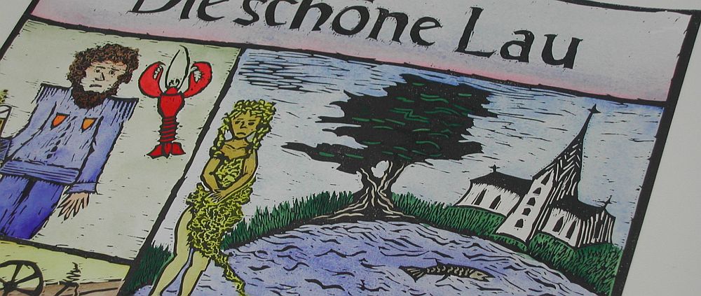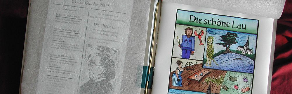
Fernöstliches Schmausbuch
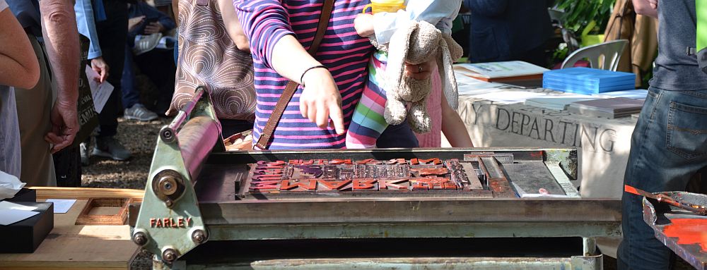
I consider myself lucky in that I have a huge stock of metal type to work with. I started off with two cases of metal type way back in 1998. One was Victor Hammer’s Uncial, the other was a well filled case of 10 pt Optima. Over the past years the stock grew to around 100 founts. It really is a treat to have so much choice. However, when it comes to relocating this will make up for a heavy load.
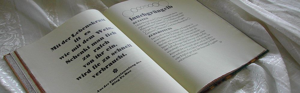
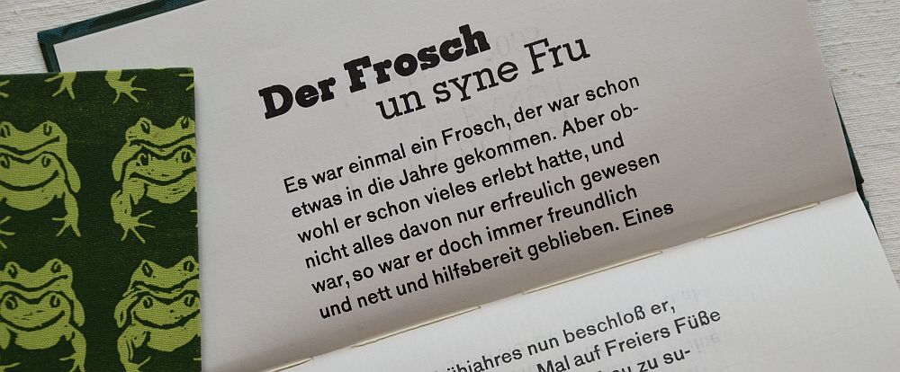
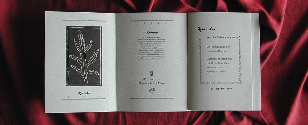
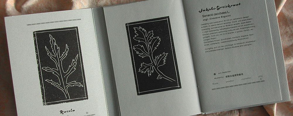
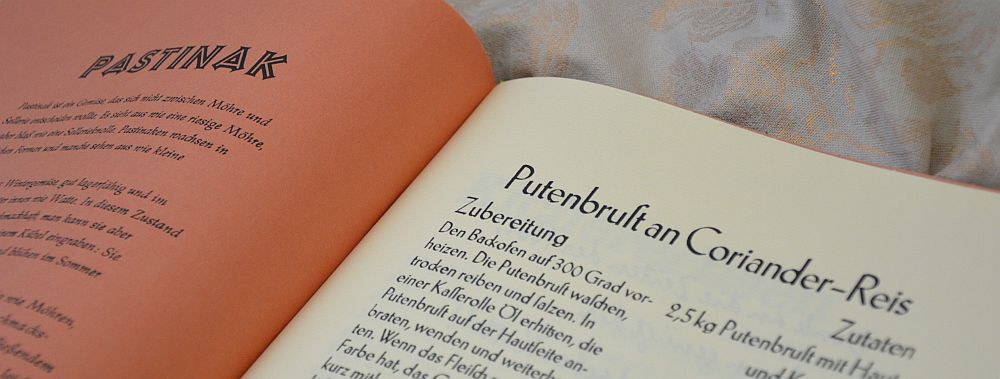
The first typographic book I made was a cookbook. As you can imagine, it was unusual in many ways. I love cooking, I enjoy philosophy and I am fascinated by founts. This easily sums up to a cookbook with philosophical texts, designed using a variety of different founts.
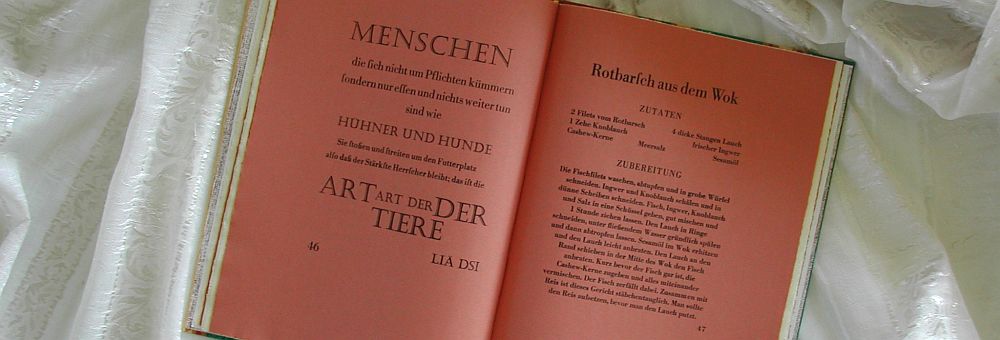
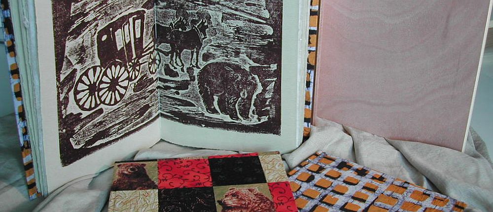
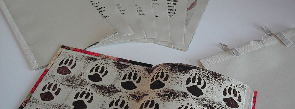
All recipes in the book are of Asian style in that exotic spices like ginger, cinnamon or curry are used. And all recipes are accompanied by an aphorism or a philosophical tale taken from Asian wisdom, like the thoughts and writings of Confucius and many others (with one ancient Roman thinker having wormed himself in). All the philosophical texts are in some way or other to do with eating and drinking or with what people relish. The book comes with some 20 recipes, printed with some 30 different founts. I printed the book in 2002 and I used most of the metal and wood type I had on stock back then.
deckled edge paper in the colours of cinnamon and ginger
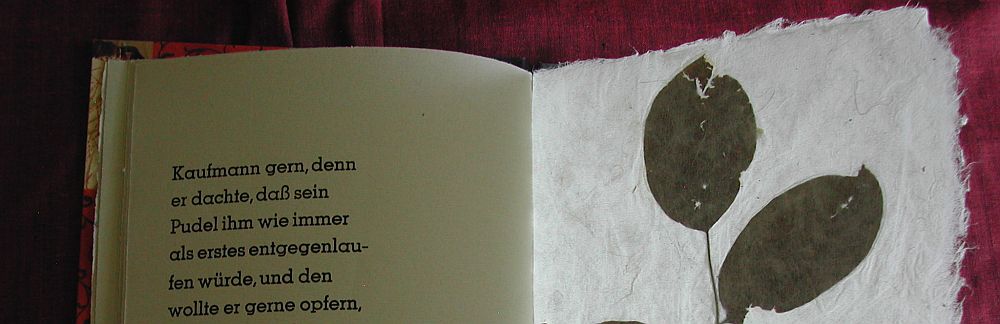
The recipes, of course, are those we used ourselves. It is quick as well as sumptuous meals, vegetarian dishes as well as some with fish or meat, and there is one dessert right at the end of the book. I used Zerkall deckled edge paper for the book in the colours of cinnamon and ginger refering to the ingredients used in the recipes.
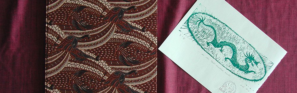
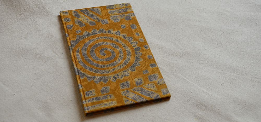
Peacock cover
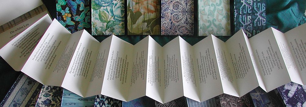
There were three different covers, made from specially chosen fabric related to the recipes‘ ingredients. One cover fabric was striped in the colours of exotic spices, one was a brown-beige fabric with a pattern resembling the ornaments on blankets used on elephants, and one was a chocolate brown fabric with a very sophisticated design of peacocks, whose home is in Asia and India. The book sold out a couple of years ago.
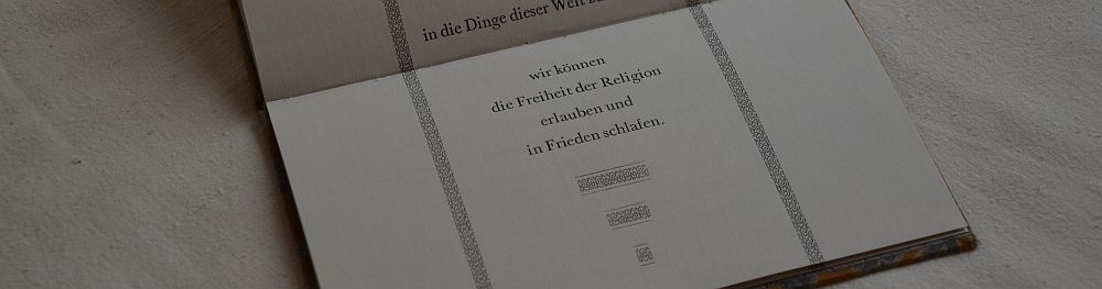
My second typographical book is a response to the beginning of the war in Iraq in 2003. I came across a speech of Honoré Gabriel Riquetti, comte de Mirabeau. He delivered this speech on August 22nd in 1789. It is on religious tolerance. Of course, back in those times, it would all be about the hostilities between Roman Catholics and Lutheran Protestants. But it can be read in a far wider sense. Basically, what Mirabeau says here holds true for all sorts of religious thoughts and the strains between them. The quintessence is that we all can co-exist. We can be braod-minded towards other peoples‘ religion and still sleep peacefully. There is no need for killing each other for religious reasons.

Taking into account that Mirabeau was an 18th century person I chose Baskerville for the text, as it is an 18th century design. I used paste paper as endpapers. The pattern is an 18th century style made by Susanne Krause in Hamburg, who specialised in making paste paper for restauration purposes. The cover is made from an African batik fabric. The design has been printed by hand on a delicate damasc fabric. The book comes in an edition of 16 copies, one of which is still for sale.
Mirabeau had been involved in the process of discussing and designing the Declaration of Human Rights. That was the particular context in which he delivered his speech on religious tolerance.
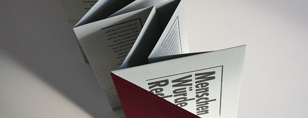
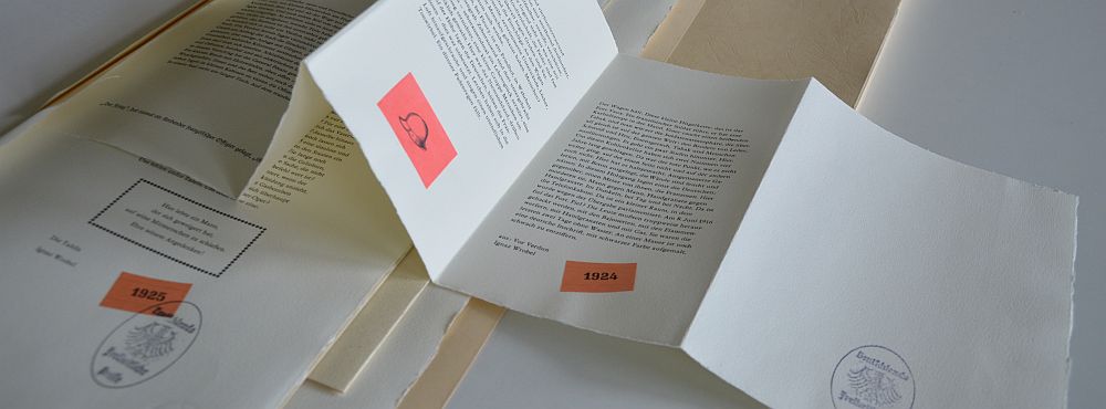
In 2005 I chose a number of articles from that declaration and made an exclusively typographic book. There was only one fount I could think of using for this book: Futura, as austere as beautiful. I wanted this book to be special in a number of aspects. I wanted its character to mirror the long-term validity of the articles in the declaration. I wanted the book to have something sovereign to it; it was to express duration and hope. First of all I chose a strong paper of green colour, since green is the shade of hope. I printed on it the grain of an old weathered wooden board, rubbing it off by hand. In this grain every single year the tree has been living has materialised, thus it is like time becoming observable. I printed the text from Futura to stand strong for itself. I gave the book a cover from kingly red silk, expressing its sovereignity. And I made the book a concertina folding whose pages can be turned and turned endlessly. While turning the pages the book will be set in motion like if it had a life in itself. Additionally, the book can be stood on a plinth. The book’s title is „Menschen Würde Rechte“ (Men Dignity Rights), it is an edition of five. The work was accepted at the new Bibliotheca Alexandrina in Egypt for their second Biennial of the Artist’s Book in 2006. One copy is part of their collection.
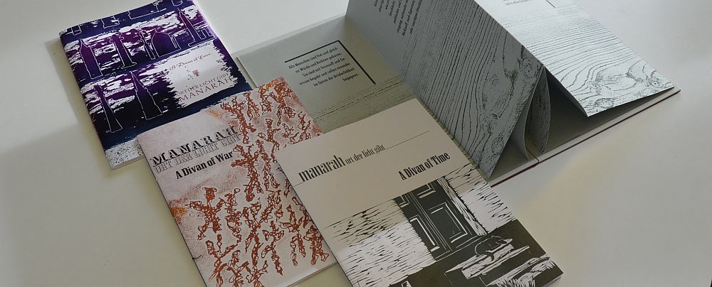
In 2009 I became aware of the activities of the al-Mutanabbi Street coalition when I met Sarah Bodman at the book fair in Hamburg. Almost instantly I joined in with their broadside project. In 2011 there was a call for artists to join the „An Inventory Of Al-Mutanabbi Street“ project. I developed the idea of the magazine-like works by the title „Manarah“. I had been doing research around this theme for some time, following the Swiss voting against minarets being built within their country. Manarah is an old Arabic term describing a place that sheds light, literally and in a wider sense. In ancient times this would have been something like a signpost or a lighthouse or whatever device to guide people on their journeys. However, over the centuries this term would develop into what we now know as minaret, the typical tower of a mosque.
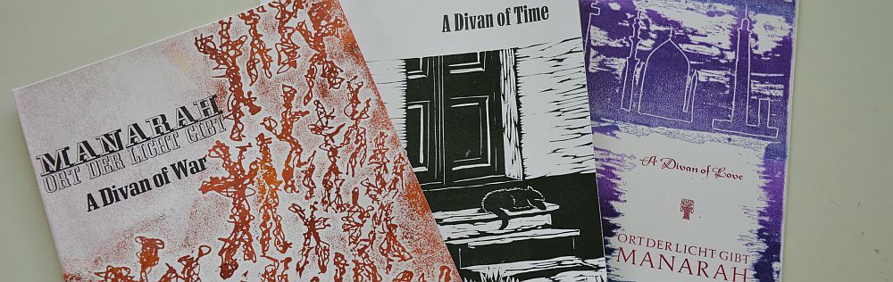
Manarah – Issues 1 to 3
My work „Manarah“ resembles a magazine. I decided to have three issues. Each issue is a collection of poetry on a special theme: war, time and love. Alltogether they span a period of some 400 years of human thinking about these themes. As this work is partly in German and partly in English it will be described in the upcoming post dealing with all my works related in whatever way to the English language. There is a special blogpost in the category „Artist’s Books“ dating from December 2012 describing „Manarah“.

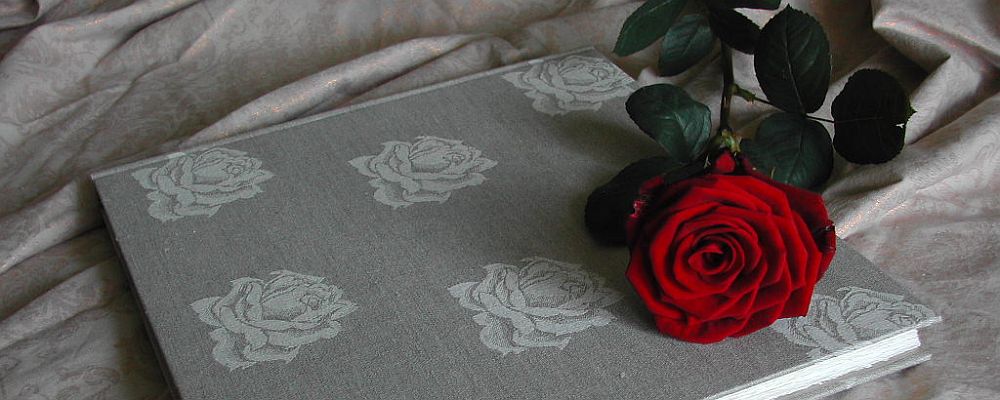
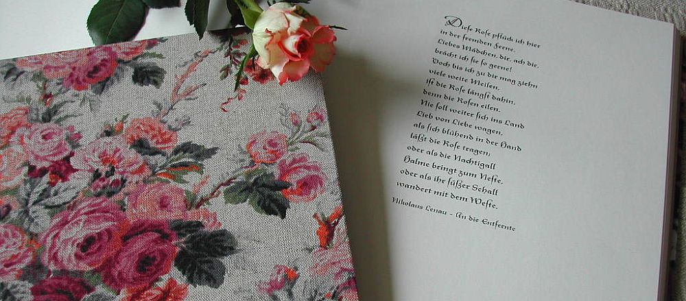
Poetical Rose Book
My Poetical Rose Books are utterly different in almost every respect, and they were deliberately designed to be that way. The most normal about them probably is their binding. Depending on their size they come with either seven or nine poems. All poems are dealing with roses in one way or another. And all poems are written by well known German poets like Heine, Hoelderlin, Theodor Storm and colleagues. The total number of pages in each book varies according to size and making between around 90 and 152. Understandably these books come with a good number of blank pages each.
Poetical Rose Book
Poetical Rose Book
Each book is meant to be completed by its owner. There are many ways this can be done. Gardeners fond of roses could use the book as their garden diary. It could be used as guestbook on a special occasion like a wedding anniversary. People writing poetry themselves could fill the pages between the printed poems with their own poetry. These books are a series of 20 one-offs. Every book’s cover is made from a special fabric with a design related to roses. Every book is unique.
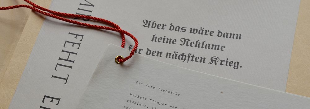
My artist’s book about Kurt Tucholsky is a very special work without doubt. It is purely typographic apart from there having been used some old clishees. There is a special blogpost dating back to July 2014 when there was an article on the book in Matrix 32, plus another one dating back to December 2012 in the category „Artist’s Books“ describing the work.
Mir fehlt ein Wort (I lack the word)
I fell for Tucholsky’s writings way back in the 1980s when still a student. He was a writer and essayist in Weimar Republic. His mastering the German language is outstanding. He saw a second World War coming. He opposed Hitler’s party as much he could. His writings are as relevant and disturbing today as they were back in the 1920s and 1930s. He pointed out that socialists and communists faced much more severe sentencing at court than conservatives and fascists. He described how economic networks, particularly concerning the fire arms industry, had their own notion about wars paying off for them. He pointed out that as these industries made their profit by selling weapons, they quite naturally had a dislike for peace. He got stripped off his citizenship by the Nazis in 1933 and took his own live two years later in his Swedish exile.
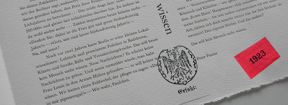
The very special feature of the book is that it is entirely made of spoiled sheets. The idea being that a young printer had collected those spoils from the waste bin at his Berlin printing office and taken them home to make a good read. He’d collected the texts he liked most in three portfolios. After him fleeing Germany for America in 1933 these portfolios end up on the desks of the Nazi party and thus were turned into files used for prosecuting and expatriating Kurt Tucholsky.
Meine Worte fallen wie Steine (My Words Fall Like Stones)
My so far newest book is entirely typographic. Also, it is of a very experimental sort of typography. Contrary to that typography originally is supposed to aid and support reading and understanding the text, here typography impedes reading, it disrupts and interferes with understanding.

This specific typography wants to make aware of our preoccupations. It wants to make us learn that we so often do not read what is written or printed but instead what meets our expectations. We are unaware of us being convinced we know the text without reading it. We reckon we can guess, and we rely on our guess being correct. The book comprises of 14 postcard-like prints. Each of them comes with one sentence. Next to the sentence a name and a year are given. All sentences have been spoken to me in real at one point in my life, in some sort of context. The context, of course, is not revealed. Readers are free to make up their own ideas of what sort of context this might have been or could be. The books are sewn in a modified way of Japanese binding. The cards are printed on a rather aged quality of brown cardboard. Covers are made from strong cardboard material in different colours. The book’s title is „Meine Worte fallen wie Steine“ (My words fall like stones). It is a series of 12 one-offs. These books are not numbered nor are they signed.

There is a blogpost dating from December 2012 by the title „My Type“ which in a way is about my stock of metal type.