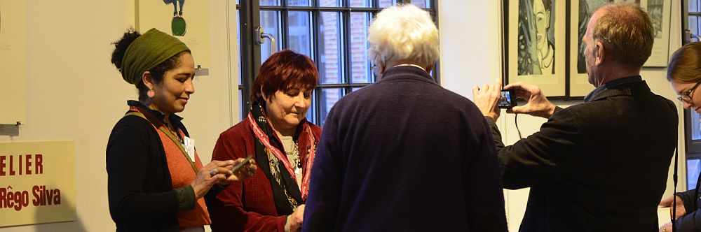
In London in the 70s
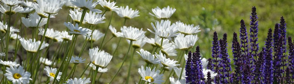
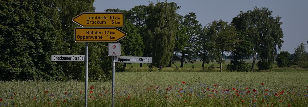
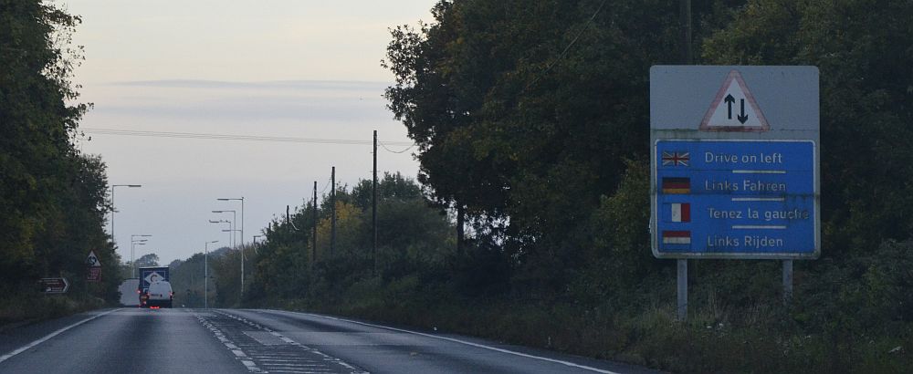
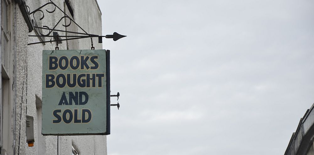
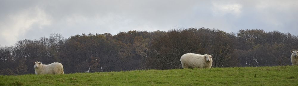
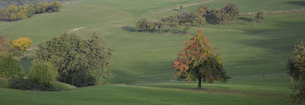
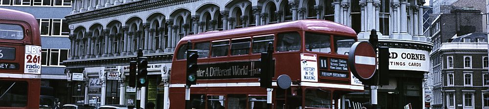
The first time I visited Britain was in 1977. I kept coming back. I remember I had to fill in these forms that were being handed out on the ferry. The note read: „Notice of leave to enter the United Kingdom for Nationals of EEC countries“. In 1984/85 I went there as a one year overseas student, staying at Keele University in Staffordshire. During the Easter vacations I was hiking from Cornwall through Cumbria and Yorkshire and visited Hull and Kings Lynn and some more places – covering the long distances by train. I’ve seen Goathland Station years before anybody knew about Hogwarts. I was staying in Youth Hostels that were old castles with thick walls and, boy, some of the nights were cold. They’d hire out hot water bottles for the nights in one place. I remember getting soaked while walking the perimeter of Beverley. I still keep coming back. I reckon it is not only to do with Walker’s crisps ‚Salt ’n Vinegar‘.
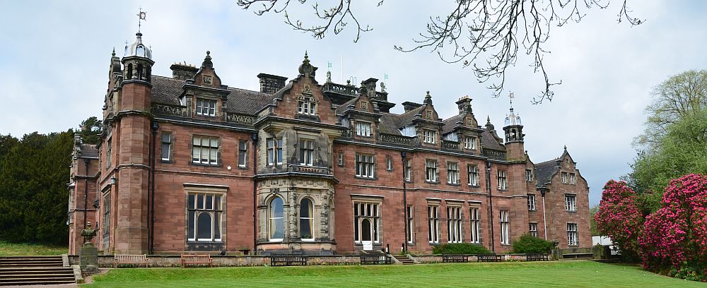
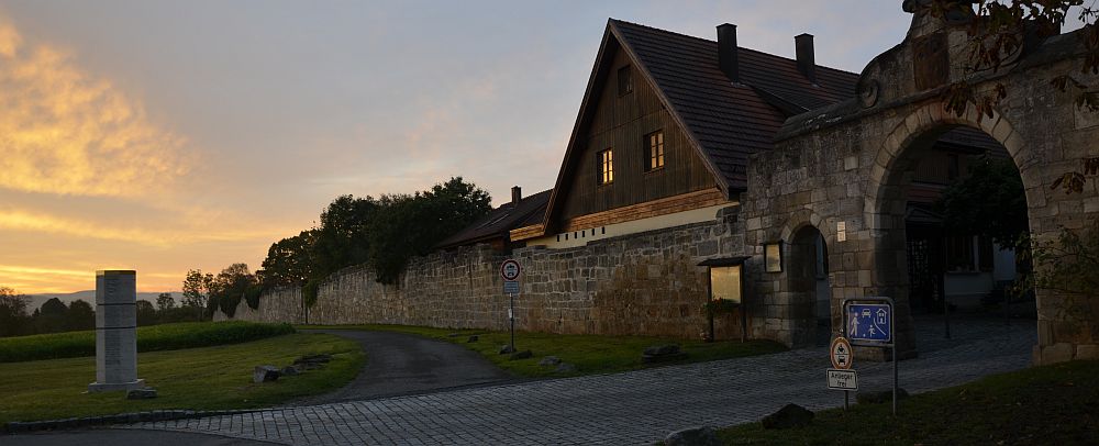
Keele Hall, Staffordshire
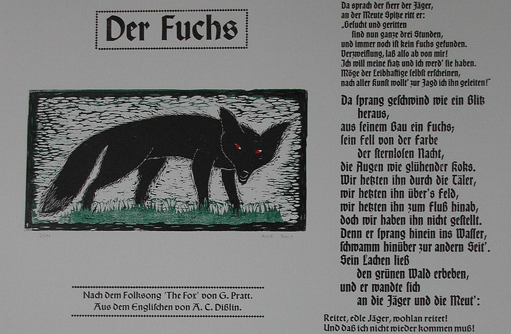
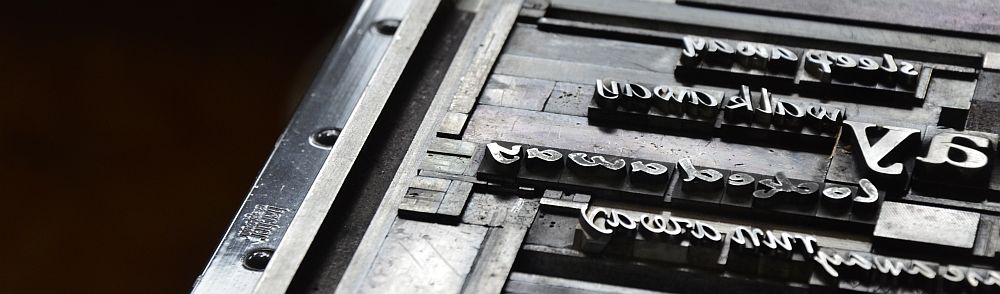
The Fox – broadside
My first work with English roots is a broadside about a little black fox. I heard the story sung to me in the students‘ union at Keele University. The folkband „Falstaff“ was playing there one night. Their song „The Fox“ mesmerised me.
„And there a-sprang like lightning / a fox from out of his hole / his fur as black as the starless night / his eyes were like burning coal.“
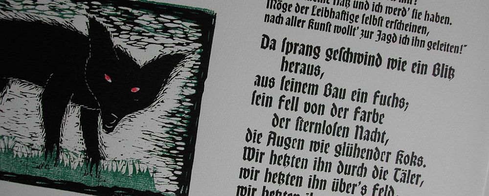
In 2001 I figured out a German translation trying to keep both rhythm and rhyme (and still making my metal type work out on it). I handset the text from a fount called „Wallau“ and made a woodcut of a black fox with bright red eyes. People kept asking for a separate edition of the fox on a sheet smaller in size, „You don’t happen to have a print of the fox on its own, do you?“. Well, this fox quickly became kind of everybody’s darling. In the folksong the fox is the devil himself. Of course he is astute, but in a very charming way. So, in the end I printed a limited edition of the fox on its own, on strong deckled edge paper.
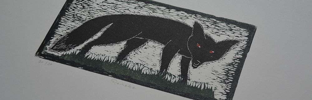
„Reinecke“
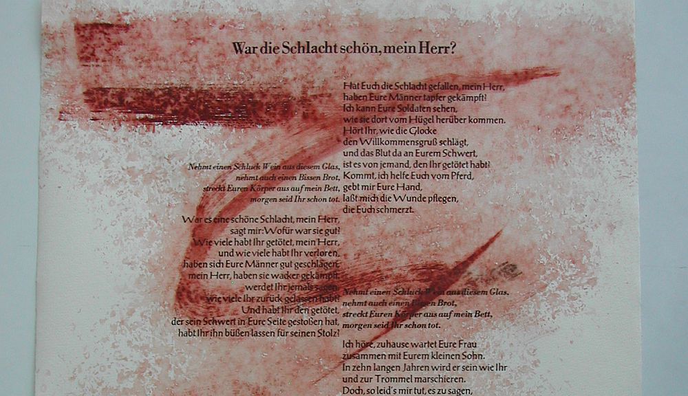
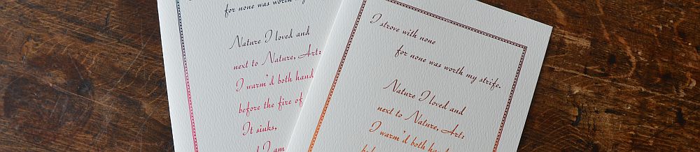
Did You Like the Battle, Sir? – broadside
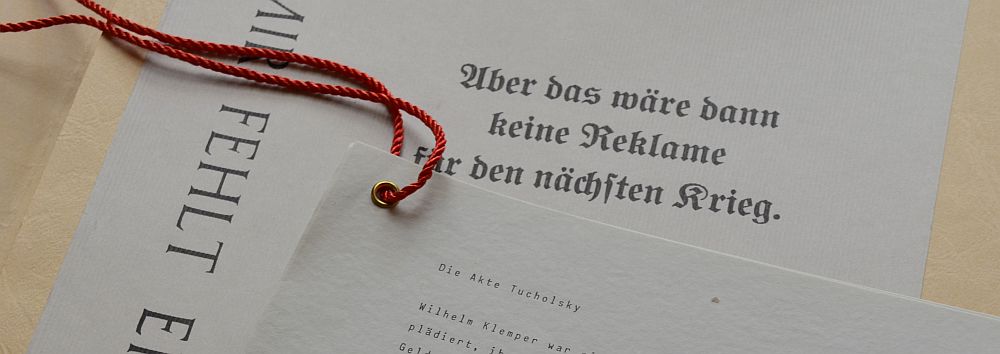
Two years later, in 2003, I started working on a second song of the tape I had bought back at that Falstaff gig. I felt it was the perfect song to choose as 2003 was when the war in Iraq begun. The song is called „The Battle“.
„Did you like the battle, Sir, / tell me of its use. / How many did you kill, Sir, and / how many did you loose.“
Originally this song is written by J. Richards and D. Pegg, says the leaflet that goes with the cassette tape.
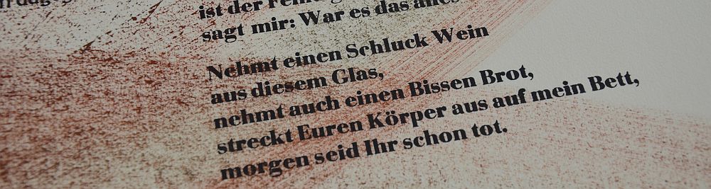
„Take a sip of this glass of wine / take a morsel of this food of mine / lay your body on this bed so fine / before you die.“
This text is handset from Bodoni. Prior to printing the words I had painted some of the sheets with dye specially made from soil pigments in the colours of earth and blood; as these would be the colours of a battle. The sheets that went with no paint in 2003 I painted over in 2008.
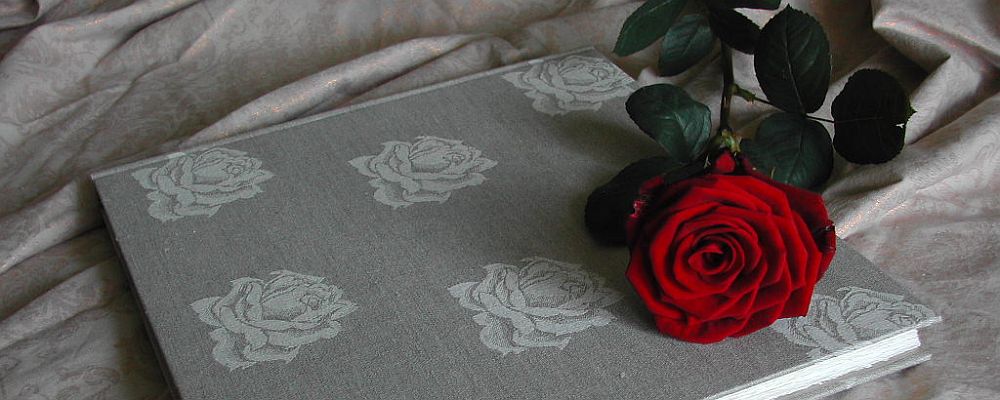
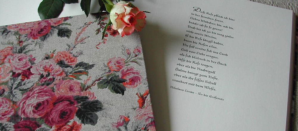
Where the Red Poppies Dance
When living in England as a one year overseas student in 1984/85 I had met with the tradition of Remembrance Day for the very first time. I was touched by the way how the consequences of war were dealt with and also by the scale of it. It left me impressed and thoughtful. Years later I came across the folksong „No Man’s Land“ by Eric Bogle. It is about the countless teenage soldiers lost during WorldWar1. I felt the lyrics expressed some very deep truth. As a young man my father had been a soldier in WW2. He was severly wounded, and even though he survived the experiences left him scarred in many ways. I felt I wanted to turn Eric’s lyrics into an artist’s book. I got in touch with Eric in Australia and thanksfully he agreed that I translate his lyrics into German and make a book from it.
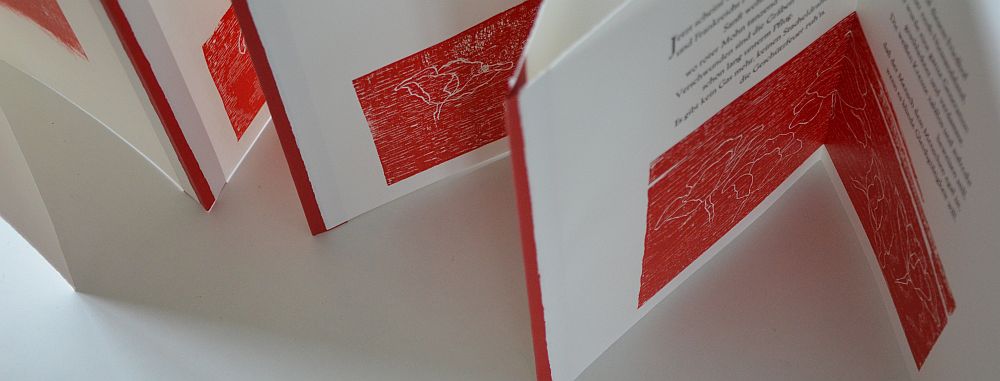
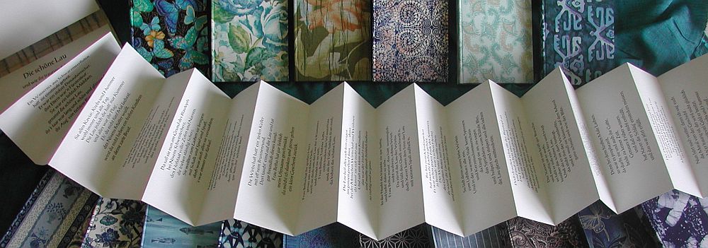
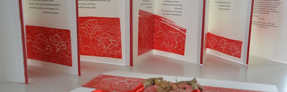
Where The Red Poppies Dance
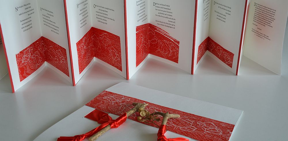
The text is set from a very old and severly worn fount of Trajanus. I deliberately chose this fount because the characters had been kind of wounded during the decades during which they had been used for printing. I felt this connected with what the lyrics were about. I made five woodcuts of poppies dancing in the wind. The blocks are oak wood. They were torn and slighlty faulted so I had to print them by hand instead of in the press. I made the book a concertina folding. I wanted it to display the whole text when folded out completely. It is a strong deckled edge paper and I used a special paper in poppy red to connect the sheets.
The book itself is housed in a portfolio with a latch made of box wood and a satin ribbon in poppy red. I chose box wood for its widespread use as a border around graves and for its symbolic character, beeing connected with eternal life. The work is an edition of 11, relating to the end of WW1 on November 11th, and was published in 2006.
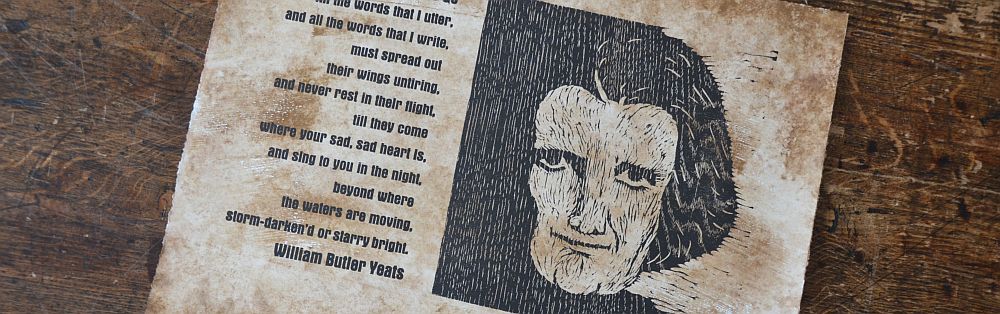
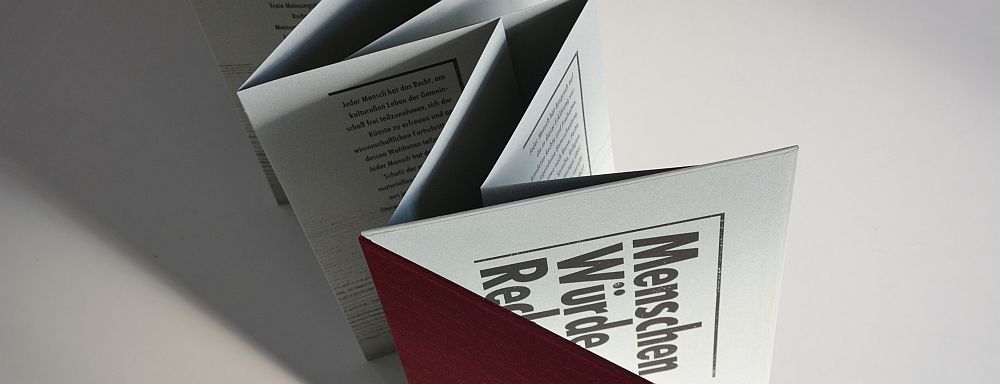
Where My Books Go – William Butler Yeats
My first artwork in English is the broadside I contributed to the broadside project of „al-Mutanabbi Street Starts Here!“ in 2009. The call for artists asked for a response to the bombing of al-Mutanabbi Street in Baghdad in 2007. In the course of this attack 130 people were wounded, some of them died. The aim of the project was to have 130 different broadsides in the end, one for each wounded or dead person. The text I choose was a poem by William Butler Yeats „Where My Books Go“. It is accompanied by a black woodcut portrait of a lady looking straight ahead. Prior to printing I painted all sheets with my own dye, prepared, again, from soil pigments. I wanted the sheet to look as if it had been torn from the rubble after the attack. Every sheet is unique in its colouring, its brushstroke, in its shades and surface structure – as unique and individual as the people affected in the attack. The project was a success: 130 artists contributed their personal broadsides. One complete set went to the Iraq National Library, many were sold as fundraisers for Doctors Without Borders. And there were more projects to follow.
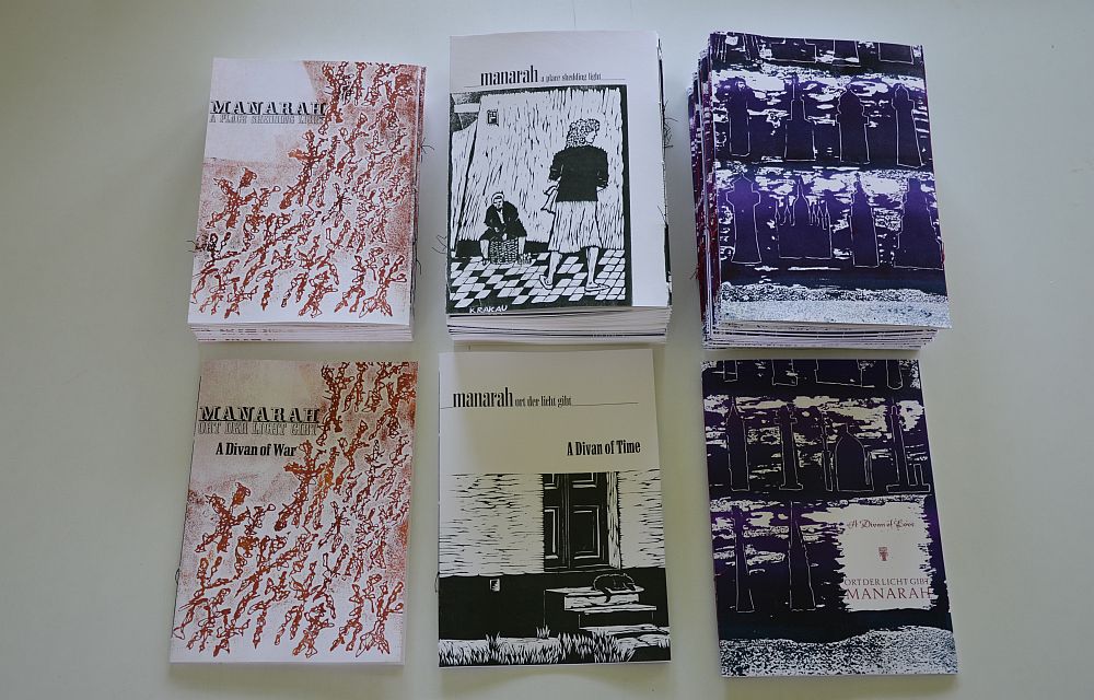
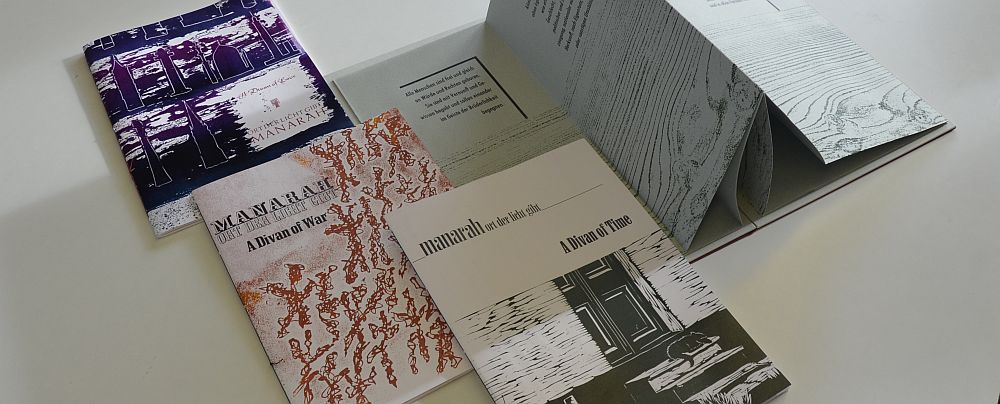
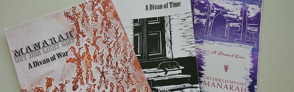
Manarah: issues 1,2, 3
Manarah: issue 1
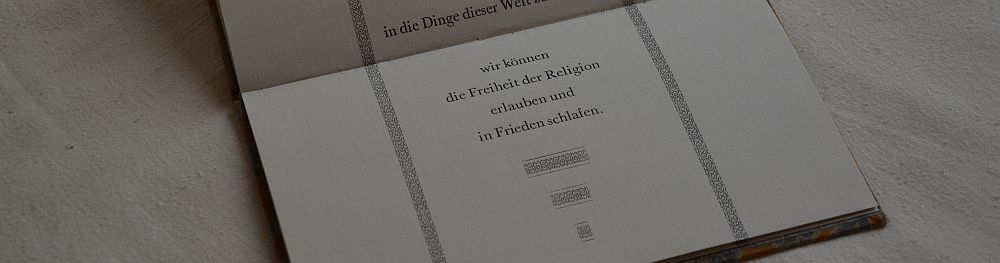
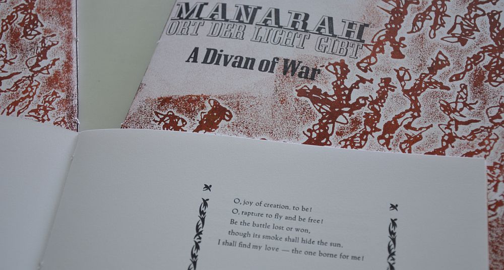
In 2011 the al-Mutanabbi Street coalition sent out another call for artists to contribute. They were to make an „Inventory of al-Mutanabbi Street“. The bomb attack not only took lives it also destroyed books and book stores and cultural heritage. The second project was an attempt to in a sense make up for the loss by creating new artists‘ books of all sorts. Be they dairies or magazine-like structures or large books, notebooks, tiny books – whatever you could think of might have been lost in the attack on a street full of bookshops and coffee houses. I contributetd three issues of the magazine-like work „Manarah“. Like with a magazin each issue deals with another theme. I choose „War“, „Time“ and „Love“ for the reason that it needs love and takes time to overcome war. Each issue is a collection of poetry. All together the poetry covers a period of four centuries of human thought and writing. The poems show what mankind has been suffering from and, also, what people have been wishing for, for a long, long time. „Manarah“ is an old Arabic word and means lighthouse, or more general a place shedding light. In the course of time it was to develop into what we now know as „minaret“.
Lyricards: Dunbar
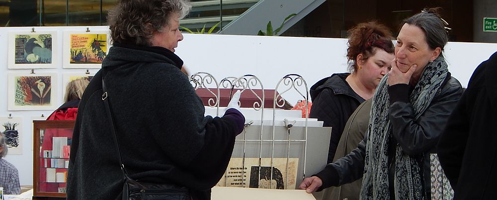
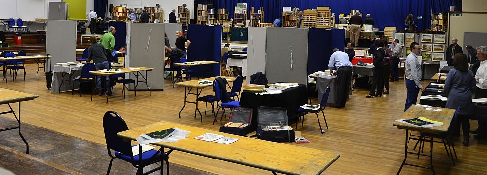
A choice of the poems from the three issues of „Manarah“ is part of the series of cards called „Lyricards“. And a strictly limited special edition of cards was printed as a fund raiser for the project. In 2013 there was a large exhibition of „An Inventory of al-Mutanabbi Street“ at the stunning John Rylands Library in Manchester (UK). The show is touring worldwide.
Lyricards special edition
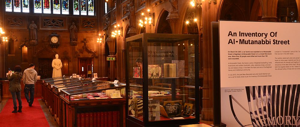
An Inventory of al-Mutanabbi Street – John Rylands Library, Manchester (UK)
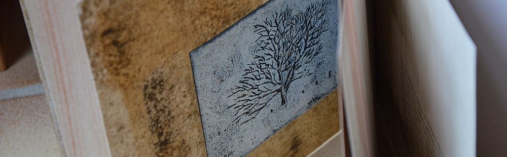
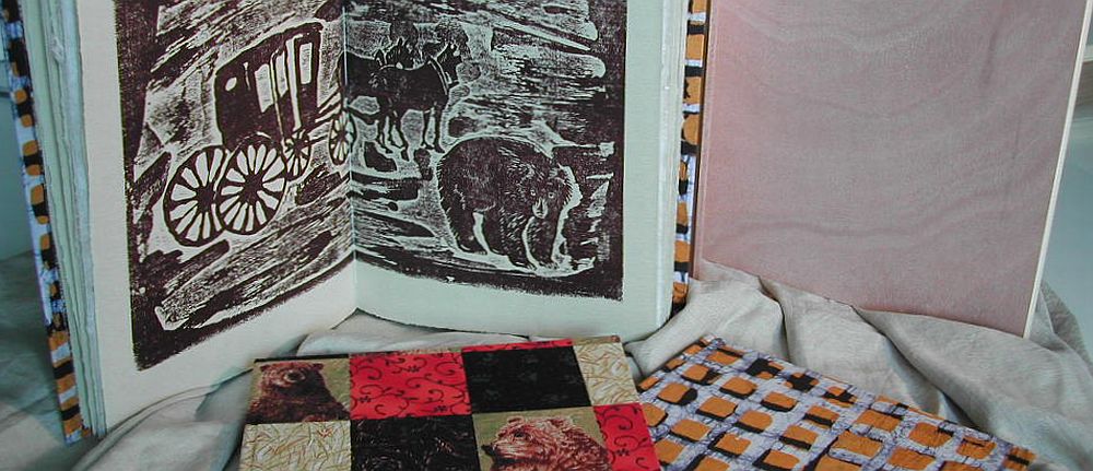
Artist’s book „Cumbria“
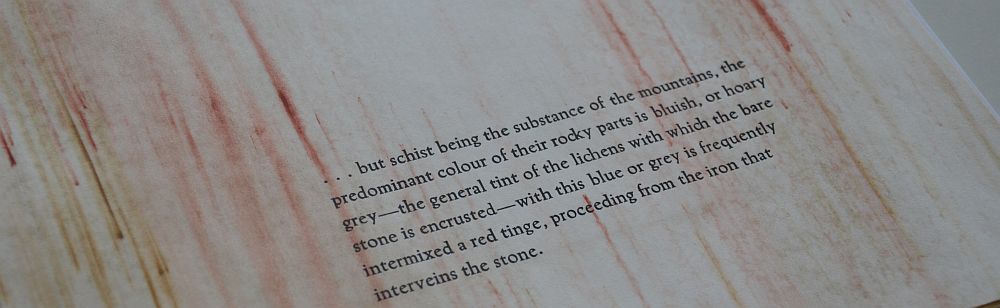
Artist’s book „Cumbria“
During my travelling in spring 1985 I visited Cumbria. I was staying in Keswick Youth Hostle which is right on the banks of river Greta in the town centre. And of course I’d read „The Guide to the Lakes“ by William Wordsworth. „Cumbria“ is a small book published in 2013. It comes with 5 woodcuts and text passages from Wordsworth’s lovely 19th century writings. All sheets are painted prior to printing back and front. The text is handset from Trajanus. It is a small edition of only ten numbered and signed copies. The cover is made from mat with a cutout window. This book is completely in English.
Artist’s book „Cumbria“

Greno printing office in Noerdlingen

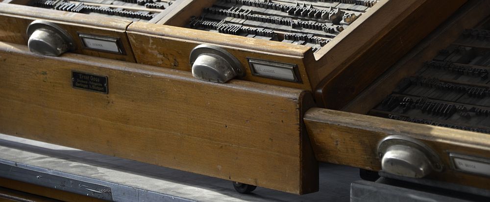
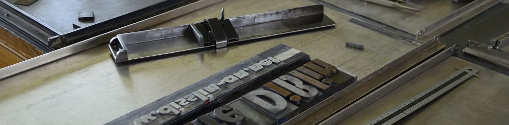
Just a two hours‘ drive to the east from where we used to live and only a few miles into Bavaria there is a small town called Noerdlingen. Until a couple of years ago you could find Greno printing office there. The building used to be a stable not far from the town centre. After being refurbished it became a stronghold of letterpress. Mr Buser, who was running the office, also kept a number of Monotype machines. When we went there to visit him he offered us the opportunity to cast our own type. Without hesitation we went for it. Well, to be honest: my husband was as passionate as he was excited about the Monotype casting process, which I was too, but still I opted for sorting the type into the cases, letting my husband have the joy (and excitement) of casting. Trying to print English text using German founts is tricky. Why? Because there are so many ‚y‘ in the English language. German hardly uses any. By casting our own type we could adjust the frequencies of characters to our own needs. It goes without saying: that was exactly what we did. Between 2000 and 2003 we went there again and again to complete our stock of Baskerville.
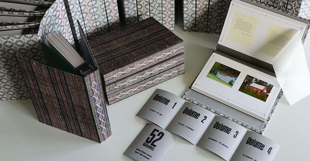
52 Weeks
In spring 2011 Marianne Midelburg, living in Australia’s state of Victoria, and I decided to make a book together. We agreed to each take one photo per week for the period of one whole year. Also, we wrote a short comment to accompany each photo. This was the idea for the book that would be published in 2014 by the title „52 Weeks“. The book itself comes in four volumes, each volume covering 13 weeks. All comments in this book are handset from Baskerville, the very metal type we had cast ourselves some ten years ago. Marianne’s comments are in English, mine are in German, but there is an English translation enclosed in a bag in volume 4. The book is being described in two earlier posts on this blog. If you just give the Photobook category a klick or the Artist’s Book category, that’s where you find more on this piece of art work.
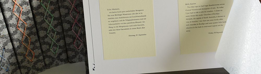
52 Weeks
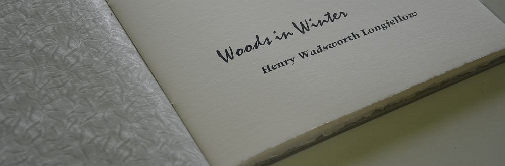
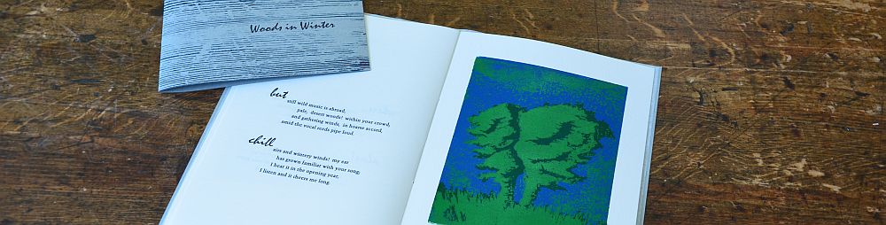
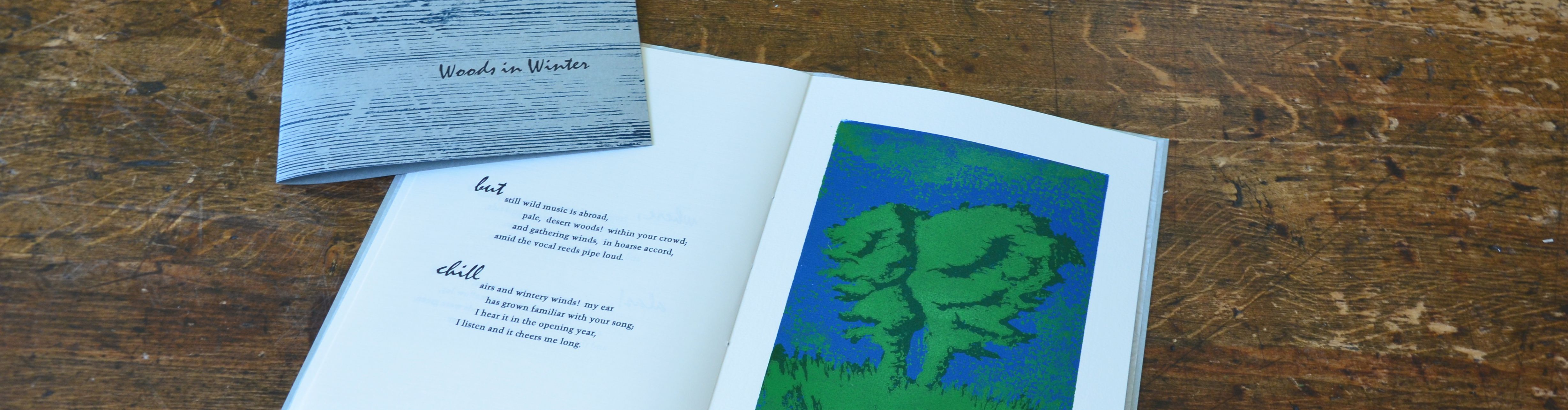
Woods in Winter
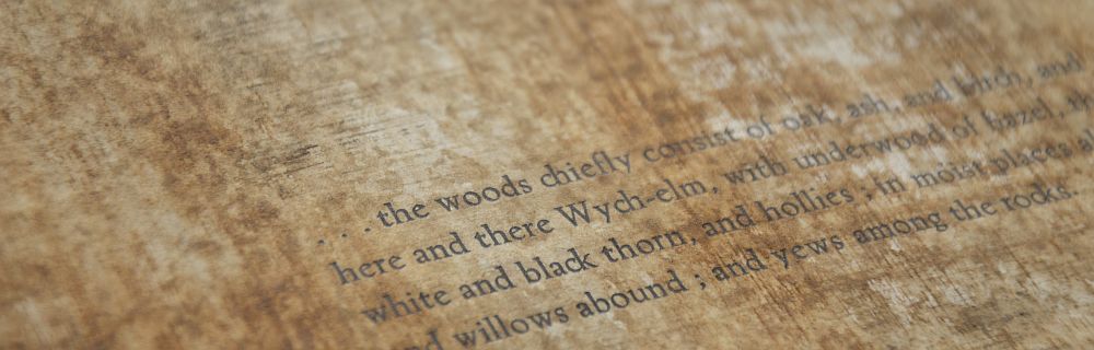
„Woods in Winter“, published in 2014, is one more book completely in English. It is a pamphlet stitch book with two linocuts and a poem by Henry Wadsworth Longfellow printed on deckled edge papers. As the poem focuses on winter, the book is kept mainly in cold colours like whites and blues. The endpaper is a sheet of white glassine paper with a pattern of ice crystals. The thread used for the pamphlet stitch is blue. The cover is printed from an old wooden board. This book, too, is a very small edition of ten numbered and signed copies.
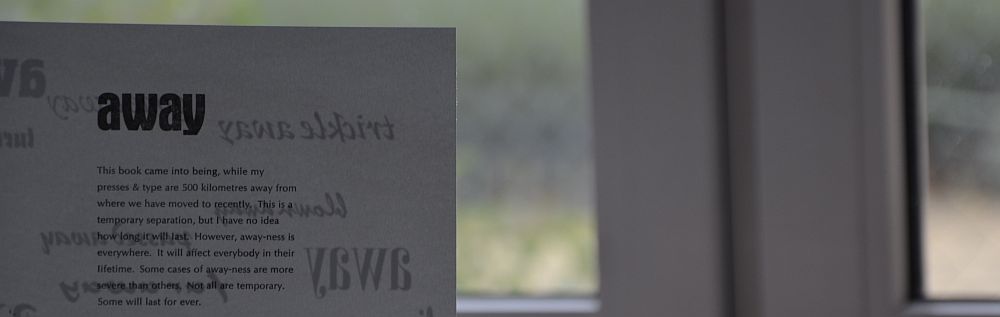
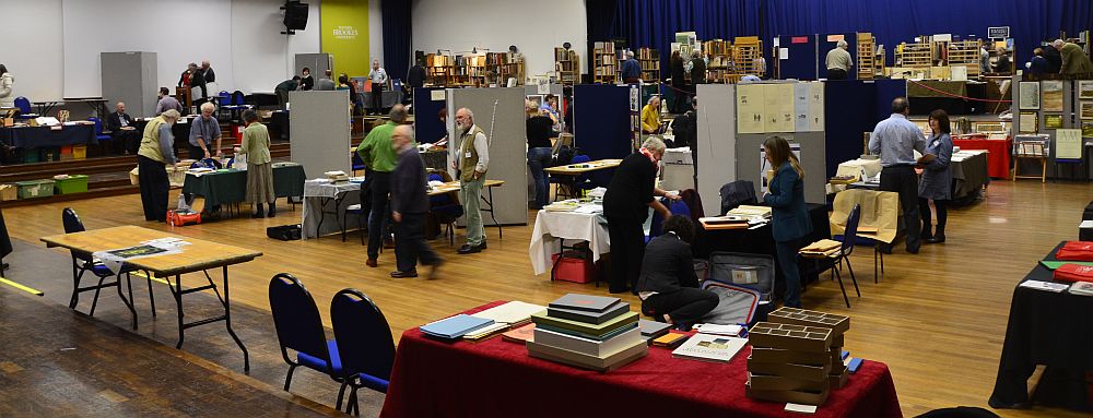
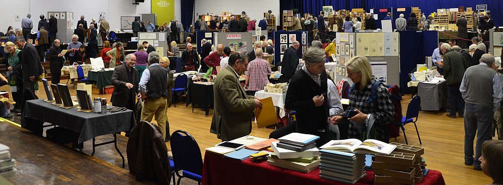
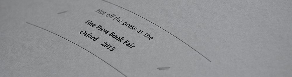
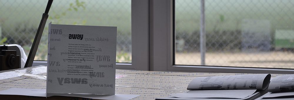
As I write this the Fine Press Book Fair in Oxford is only days ahead. My new book will be out there, hot off the press – so to speak. This book, as well, is completely in English. Its title is „away“. Away-ness has become a very present if not dominant feature in my life over the past couple of years. Right now my presses and metal type are some 500 kilometres away from where I currently live. Away-ness can be a temporary phenomenon or lasting for ever. The book is all about the various aspects of away-ness. I did all the composing and printing work during a working visit at my studio in early October. Each book comes with an individual choice of 12 photographs, making the work an edition of 12 numbered and signed one-offs. The first copies will be on my table at the Fine Press Book Fair at Brookes University in Gipsy Lane, Oxford on 31 October and 1 November 2015.